Deliberate Practice | Accepting your weaknesses & working on them! (Practicing People)

Being a creative person professionally is an awkward balancing act of wrangling ‘creativity’ and applying the technical skill of putting out into the world the thing that’s in your head, but in a way that people respond to in the way you want them to. What happens to your art once it’s out in the world is a whole other blog post.

In regards to skill, a lot of people think art skill is something you’re born with, but it’s really, really not. So to continue to grow as artists on a technical level, we need to be able to see, accept and decide to work on those elements we still feel awkward about. The part we feel shame about. Ugh. In order words, we need to practice “deliberate practice”. (For a great podcast on this, see my fave episode of Freakonomics: How to Become Great at Just About Anything. )

When it comes to visual art, we all have things we just like to draw, and things we just… happen to ignore conveniently. My love and hate is drawing people. I think this is sort of universally a challenge for a lot of artists because the human brain is so in tune with how people should look and is on high alert for ‘bad people’ (See the Uncanny Valley effect, for an example, look at the people animation in Toy Story 1, or the re-drawing of Sonic the hedgehog to make him more cute and less human like, including removing his human teeth.)

It’s sort of an ironic love and hate because the first type of art I got very good at as a kid was drawing pencil portraits of classmates and family members. I specifically drew girls, boys felt so much harder because boys weren’t as accepting of flattery that hides mistakes.

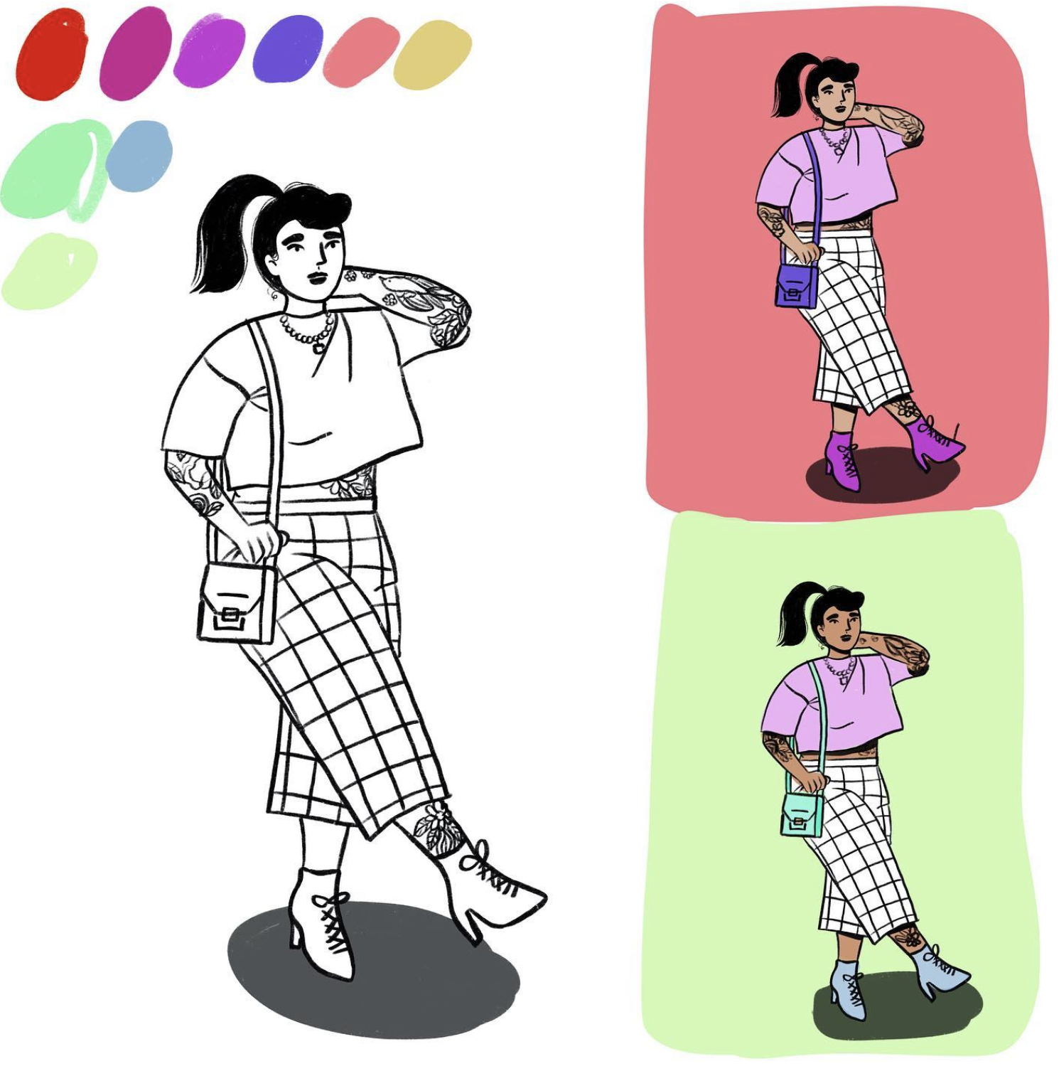
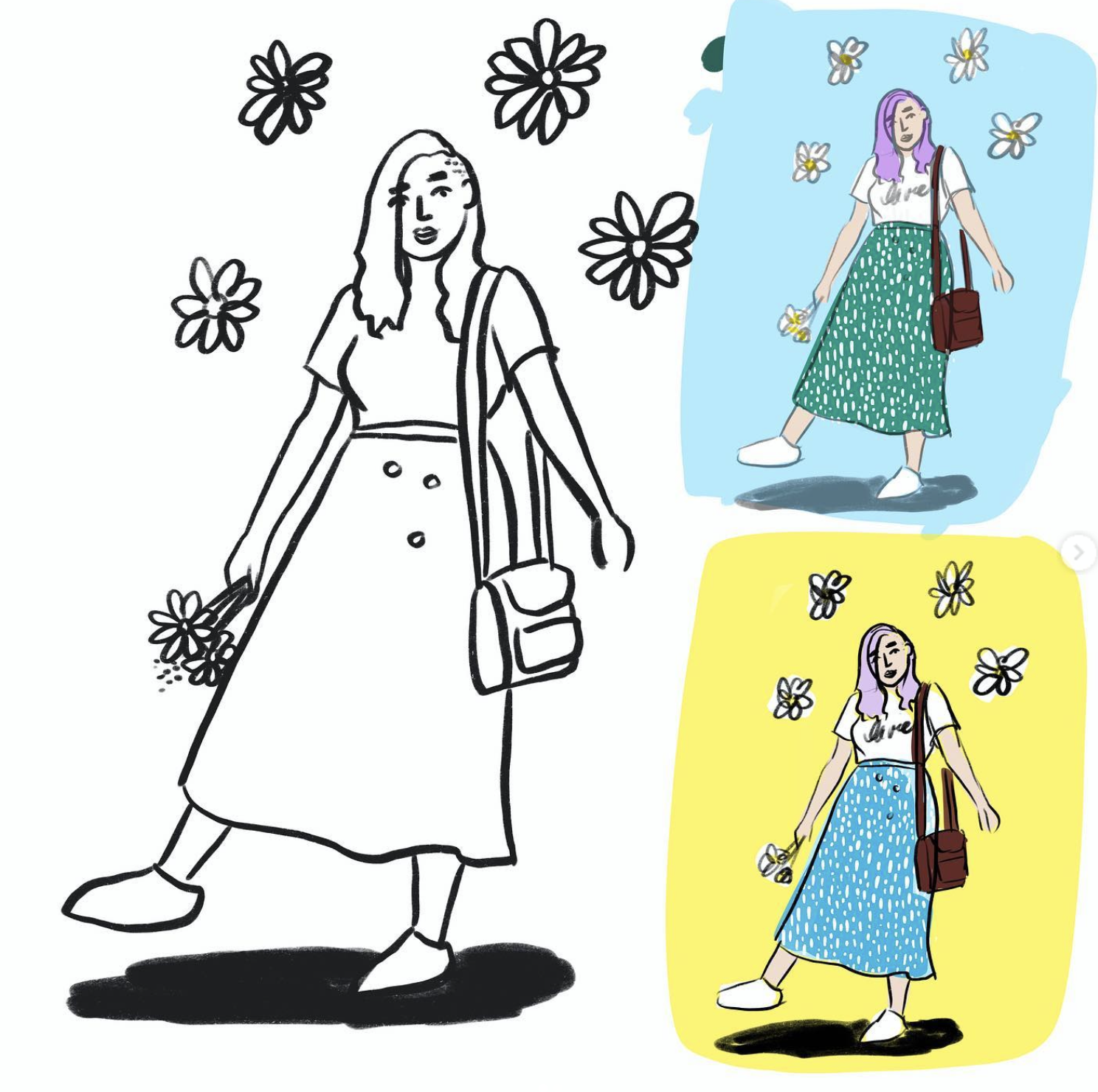
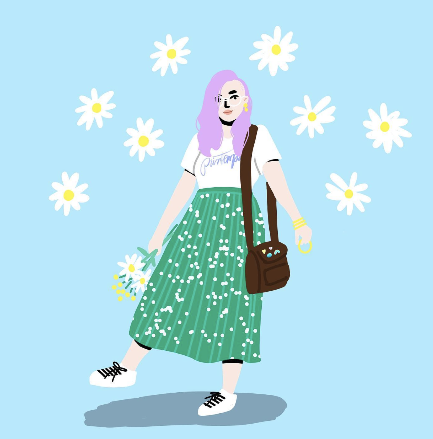
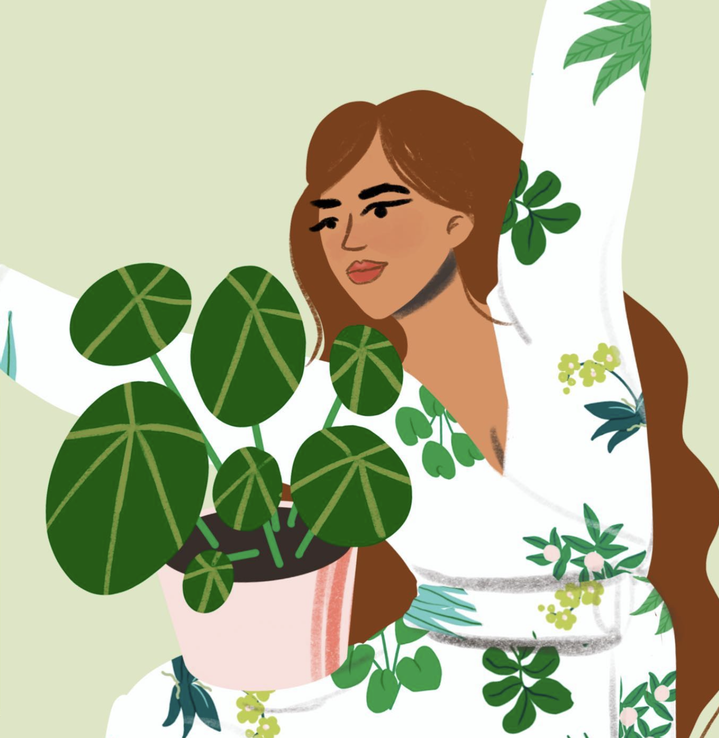
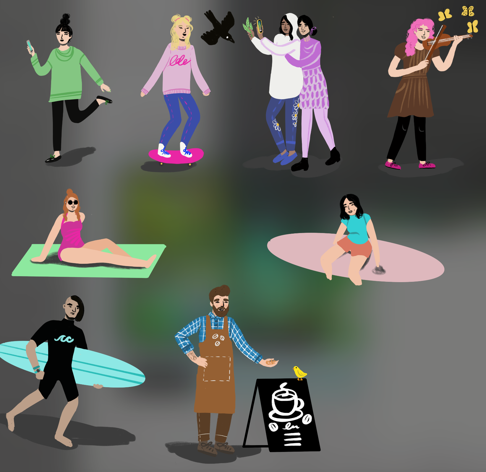
In my graphic design and illustration work, we are often trying to think of how to best get across information to people in ways that are easy and intuitive for our brains to process. Often information is emotional, rather than analytical. Now, compared to other things, it’s very easy in campaigns to ignore having to illustrate people. But when it keeps coming up as an idea, that’s when you need to realize you are avoiding it and own that facing it head on will make you stronger. So starting in April 2021, that’s what I decided to do. Make room in my practice for practicing people.

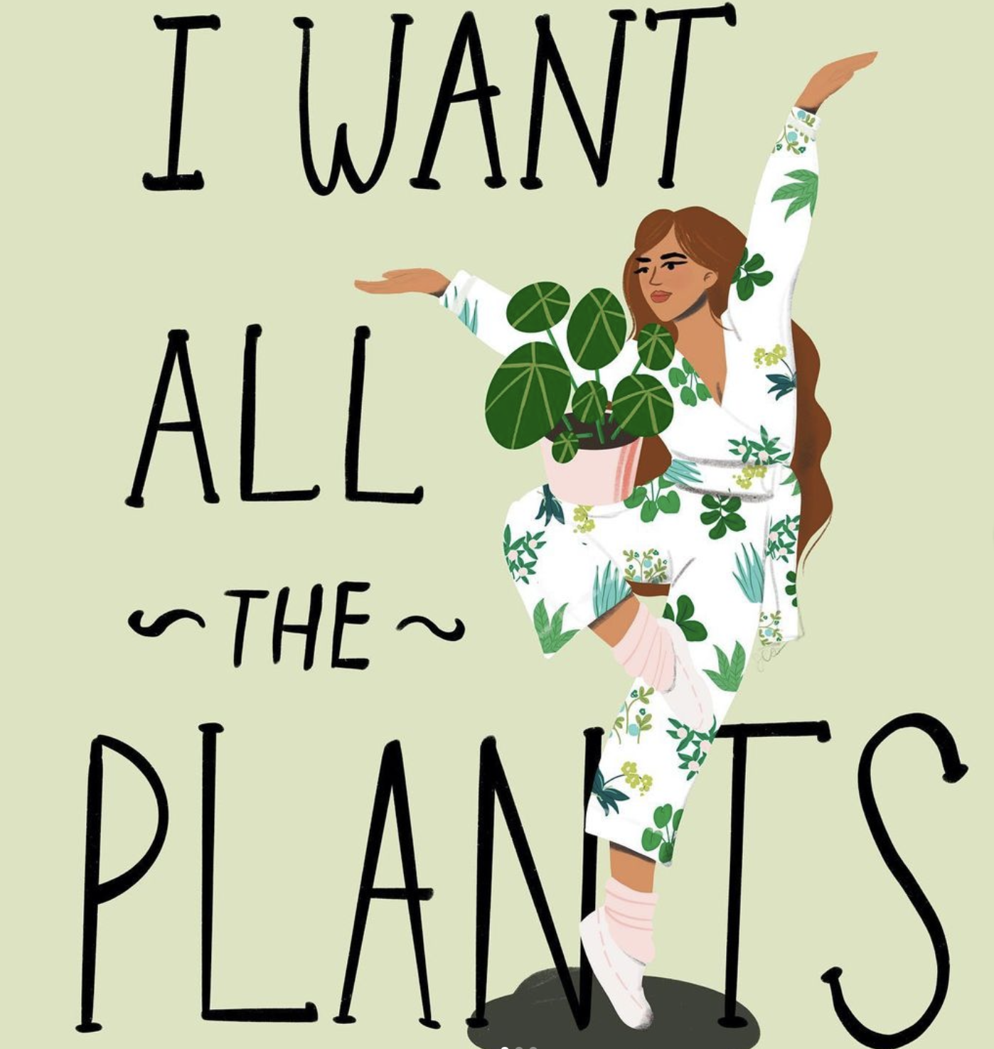
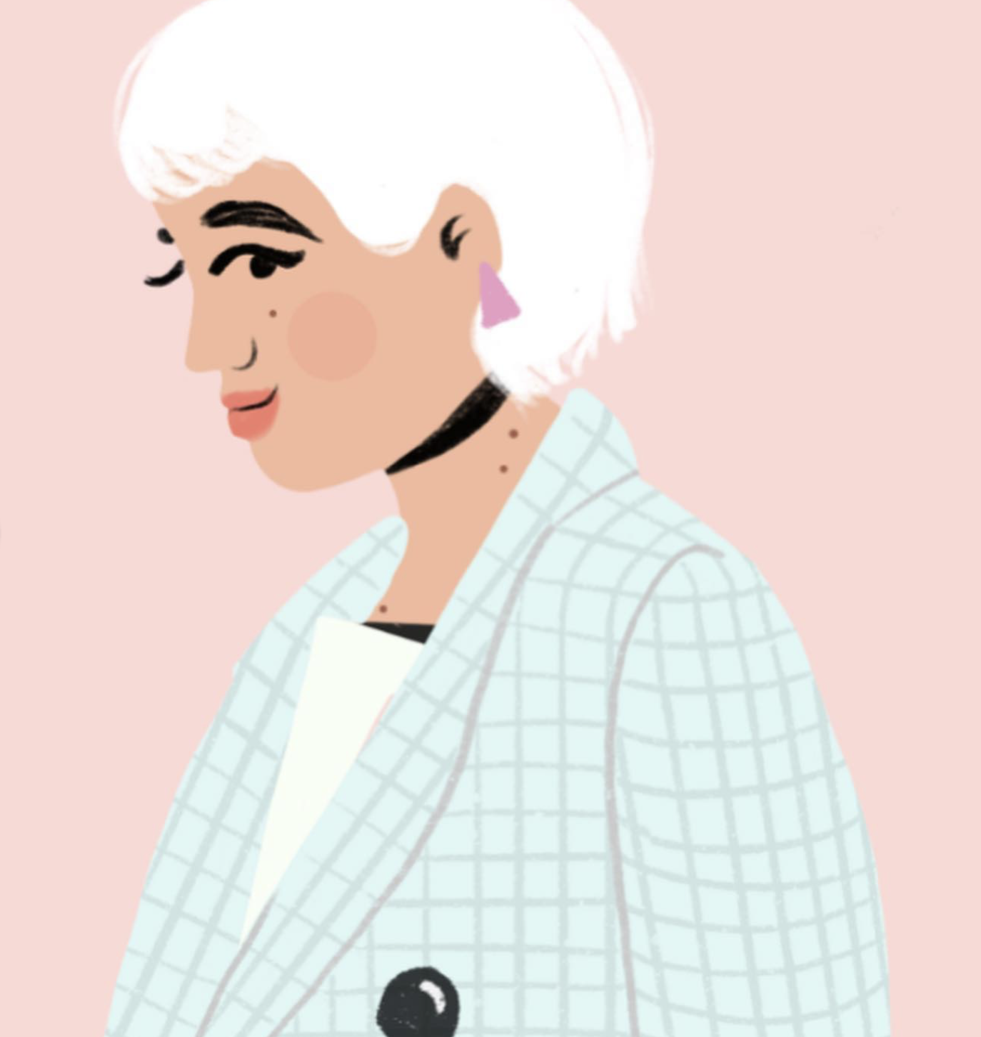
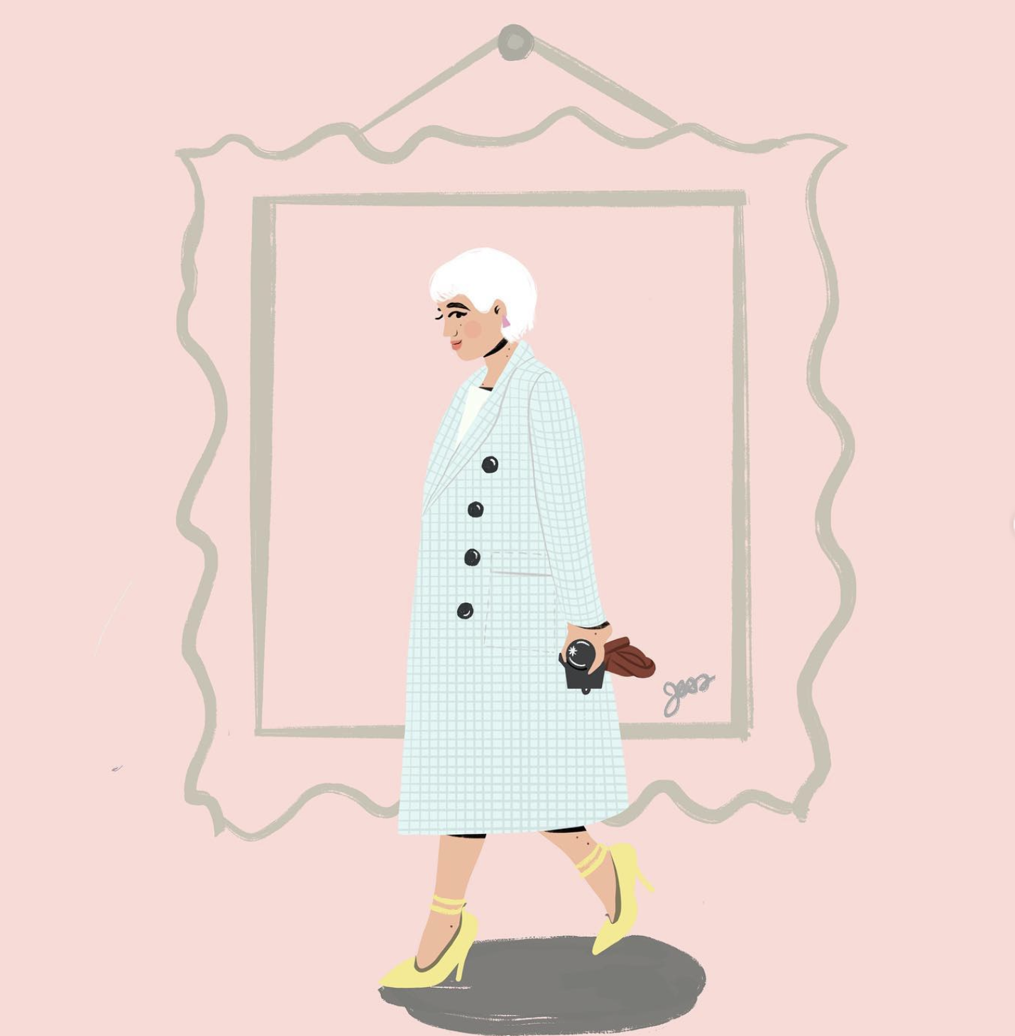
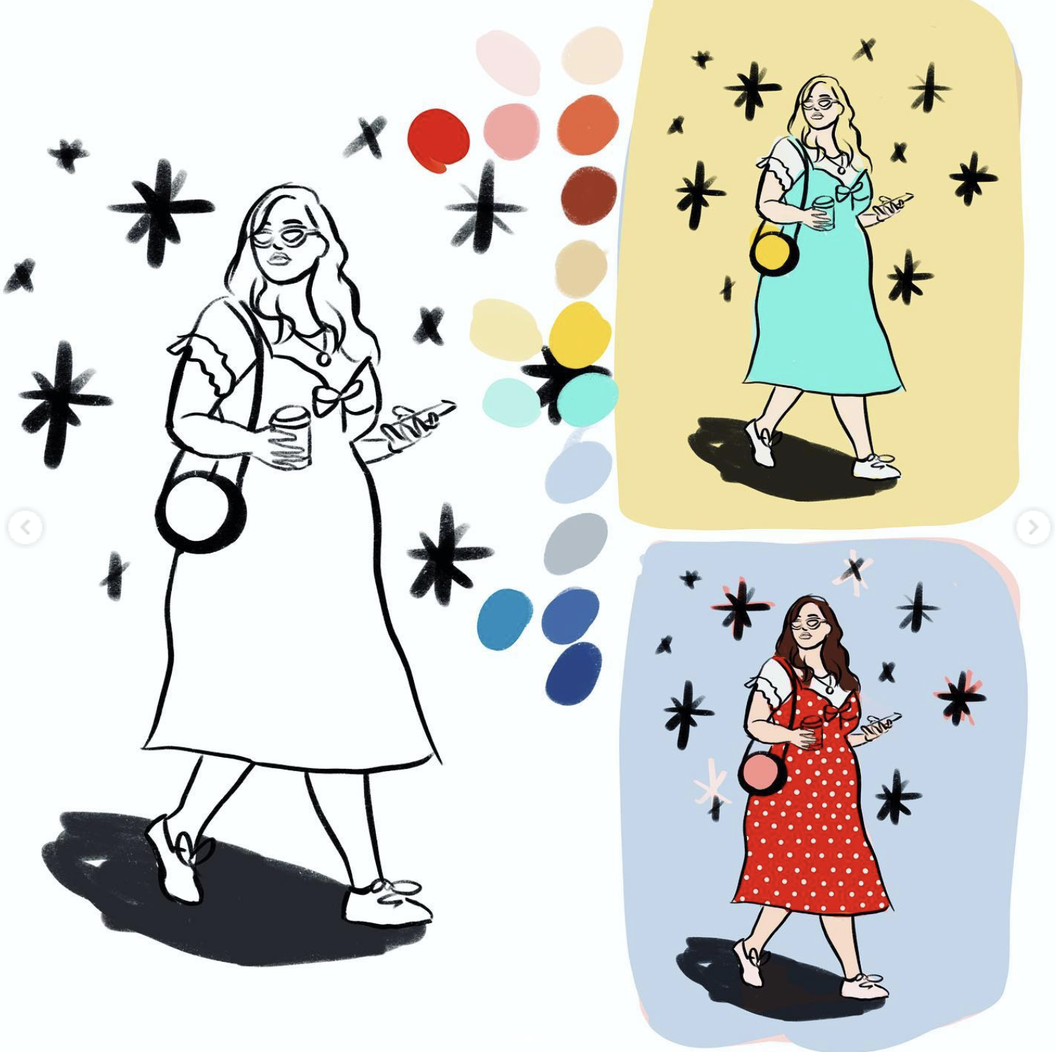
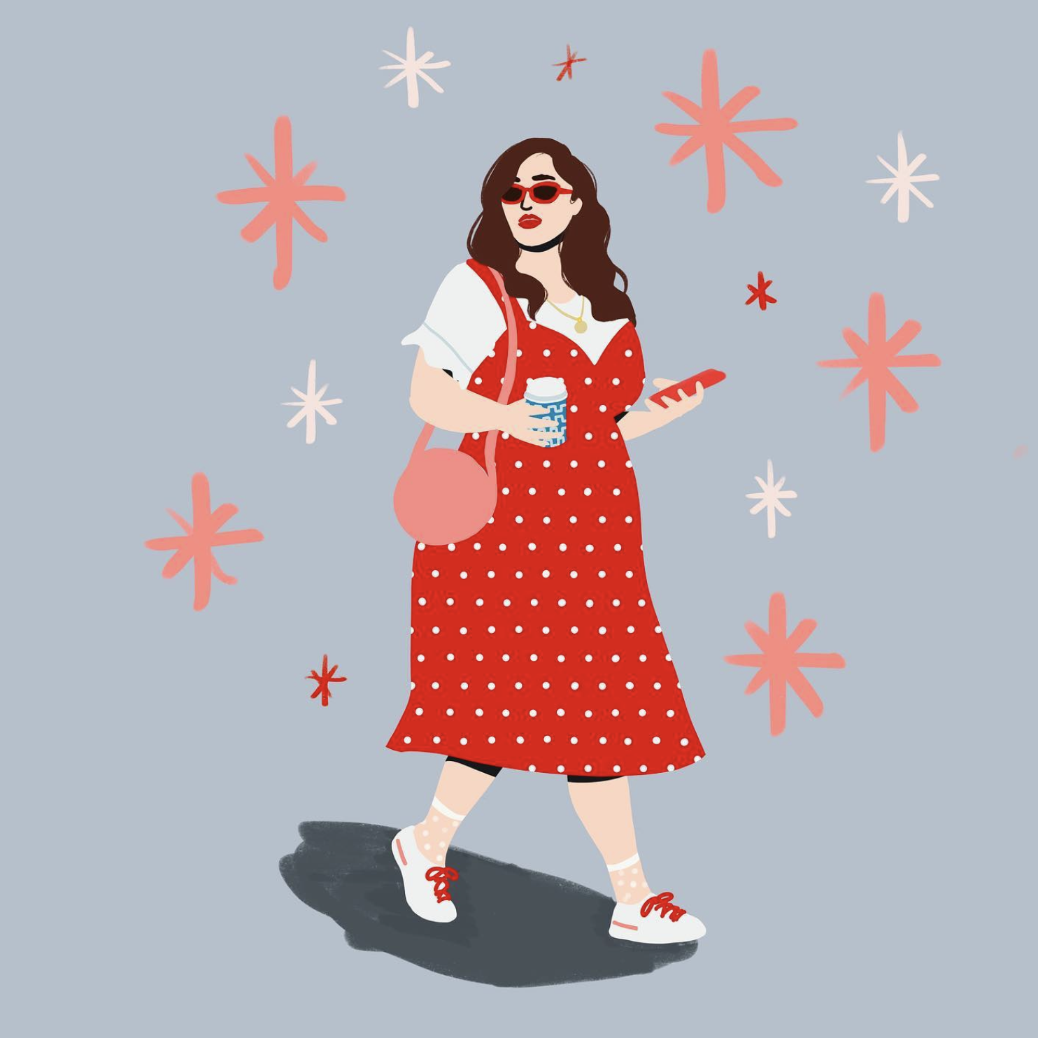
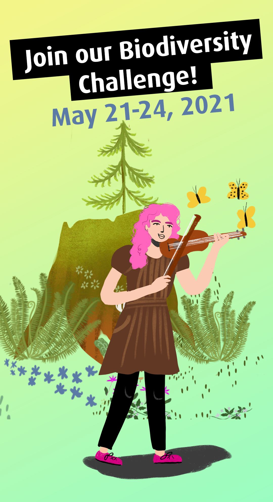
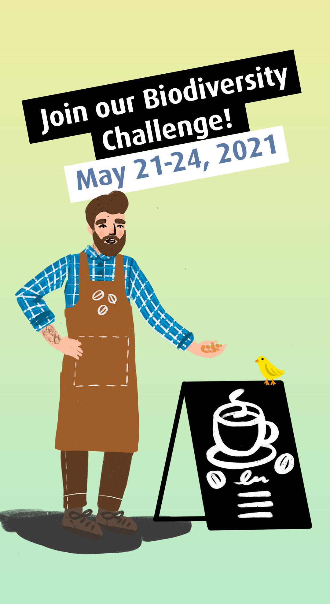
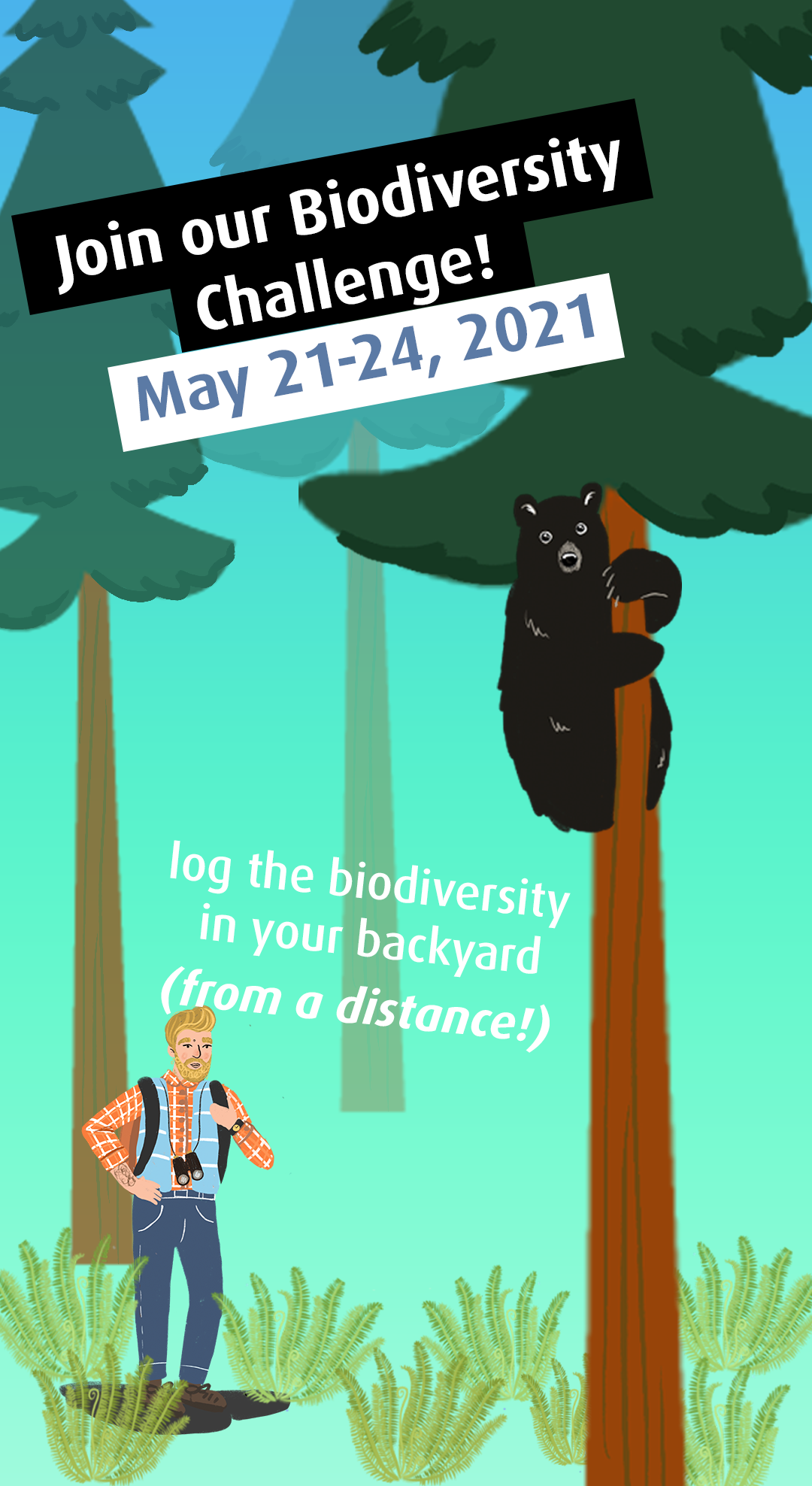
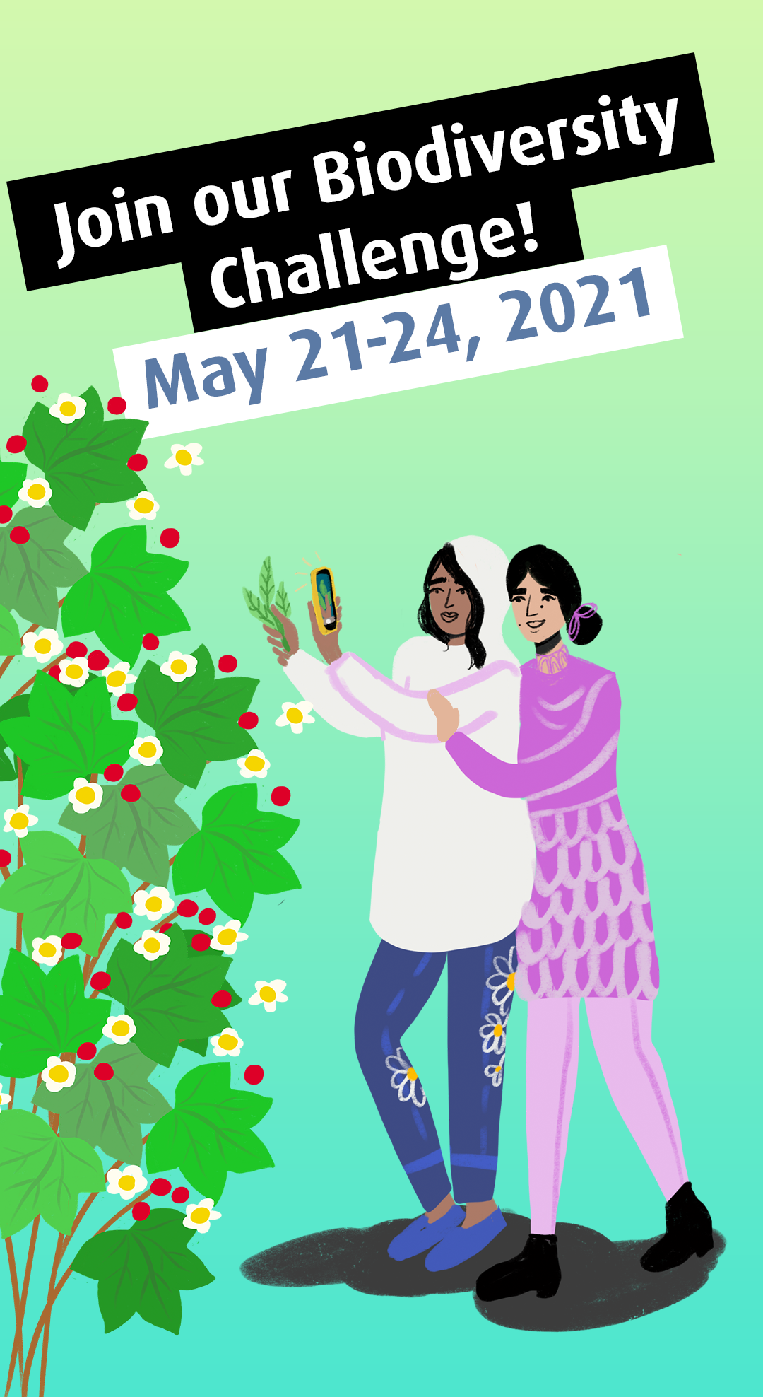
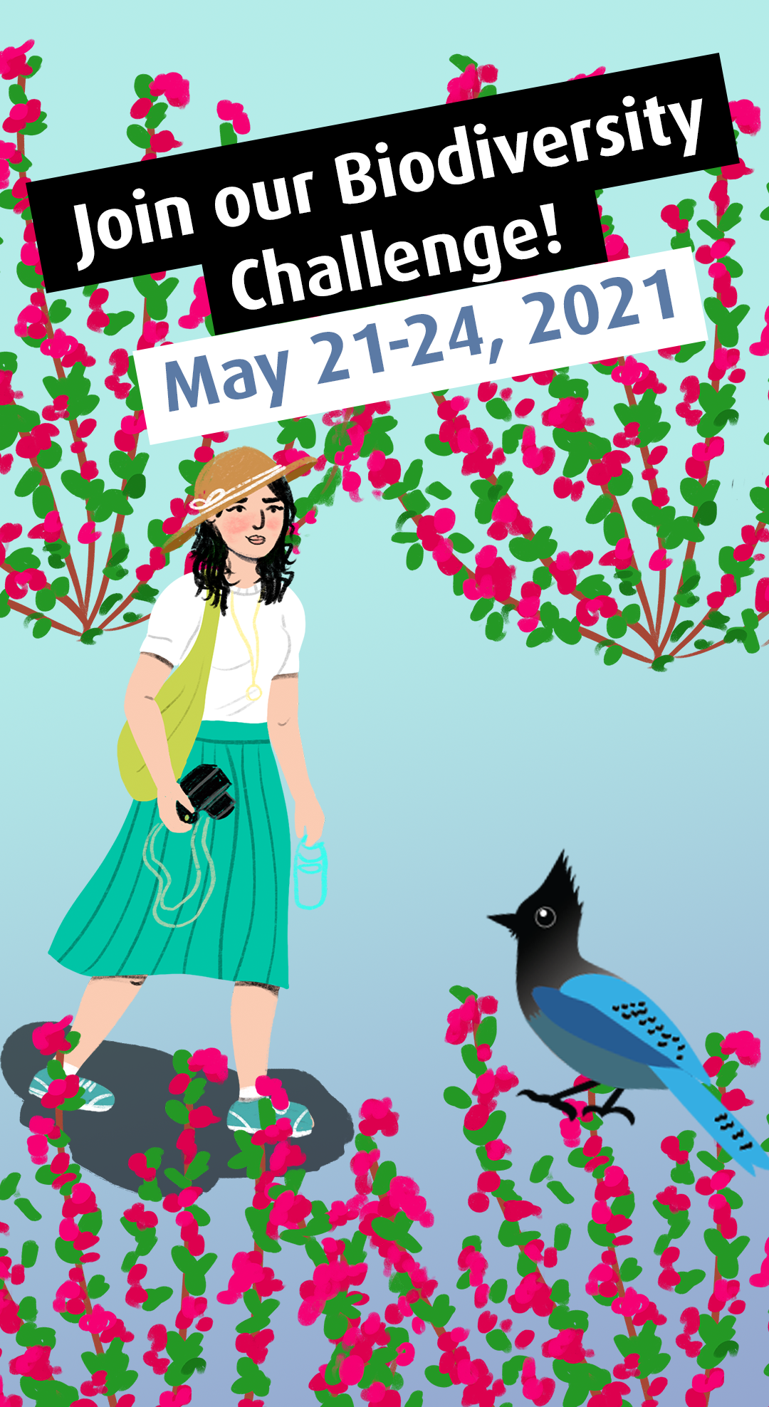
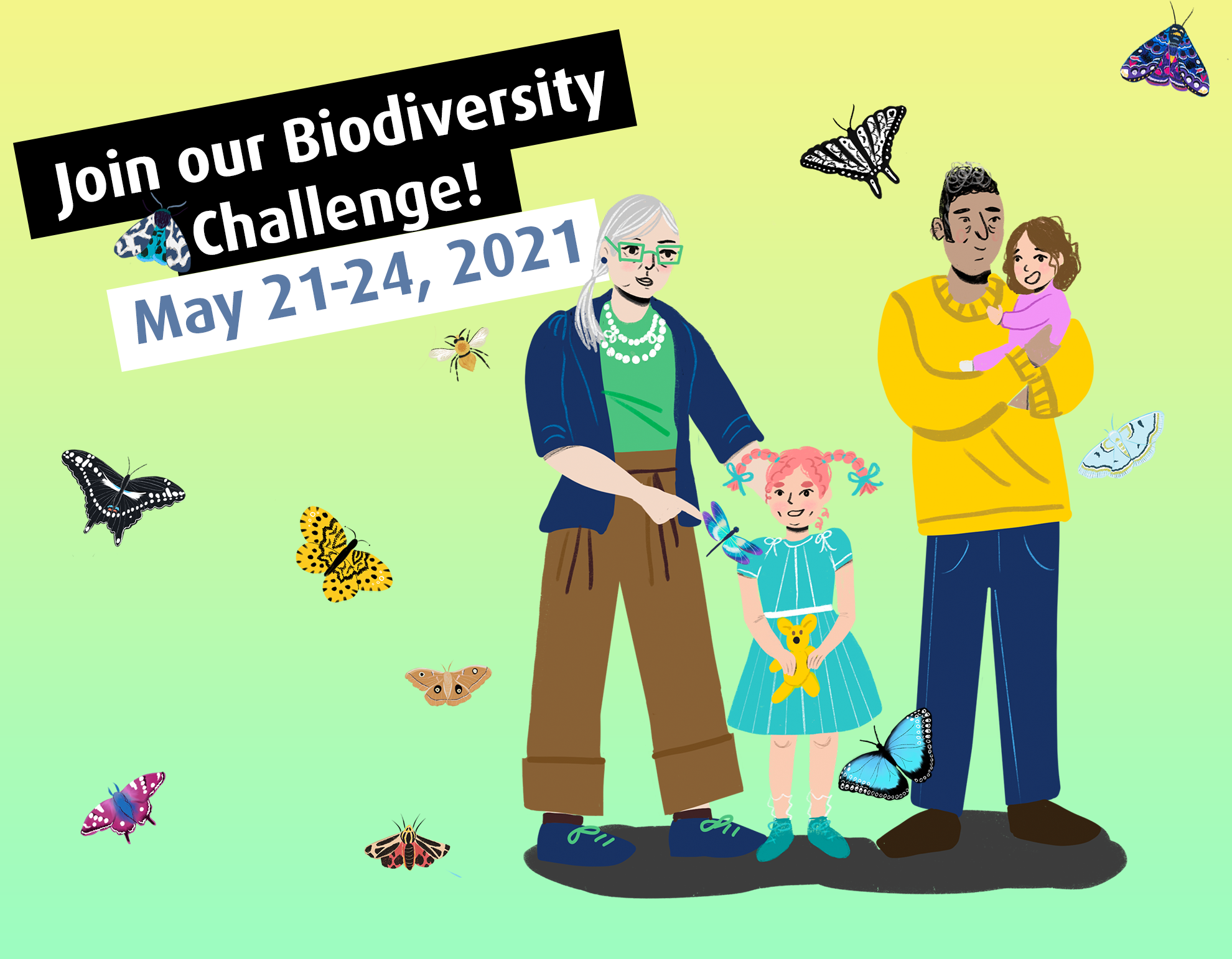
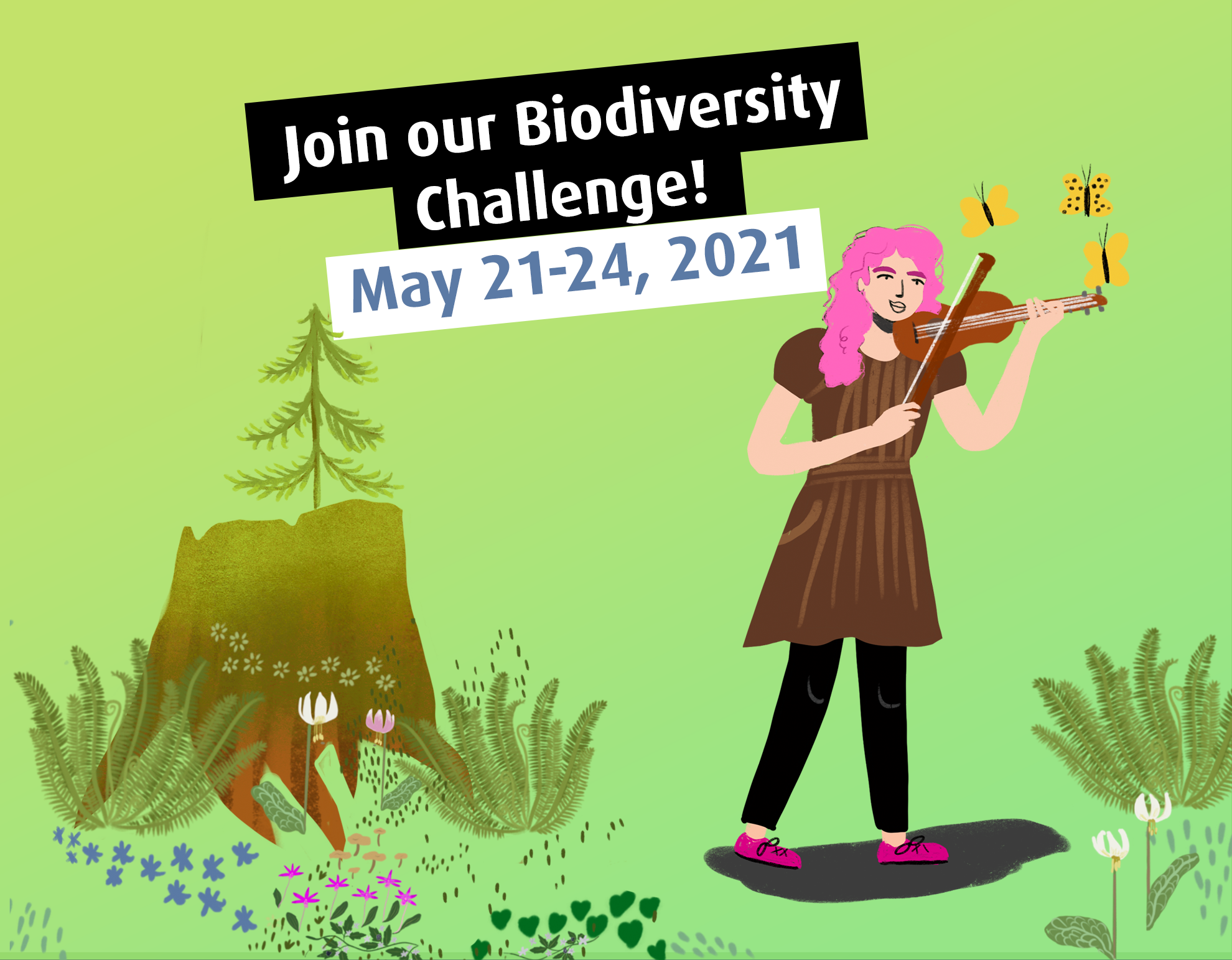
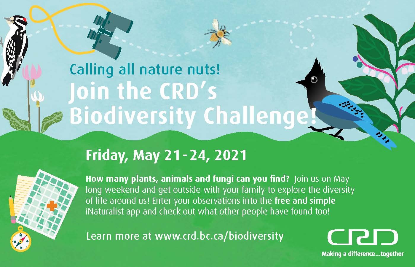
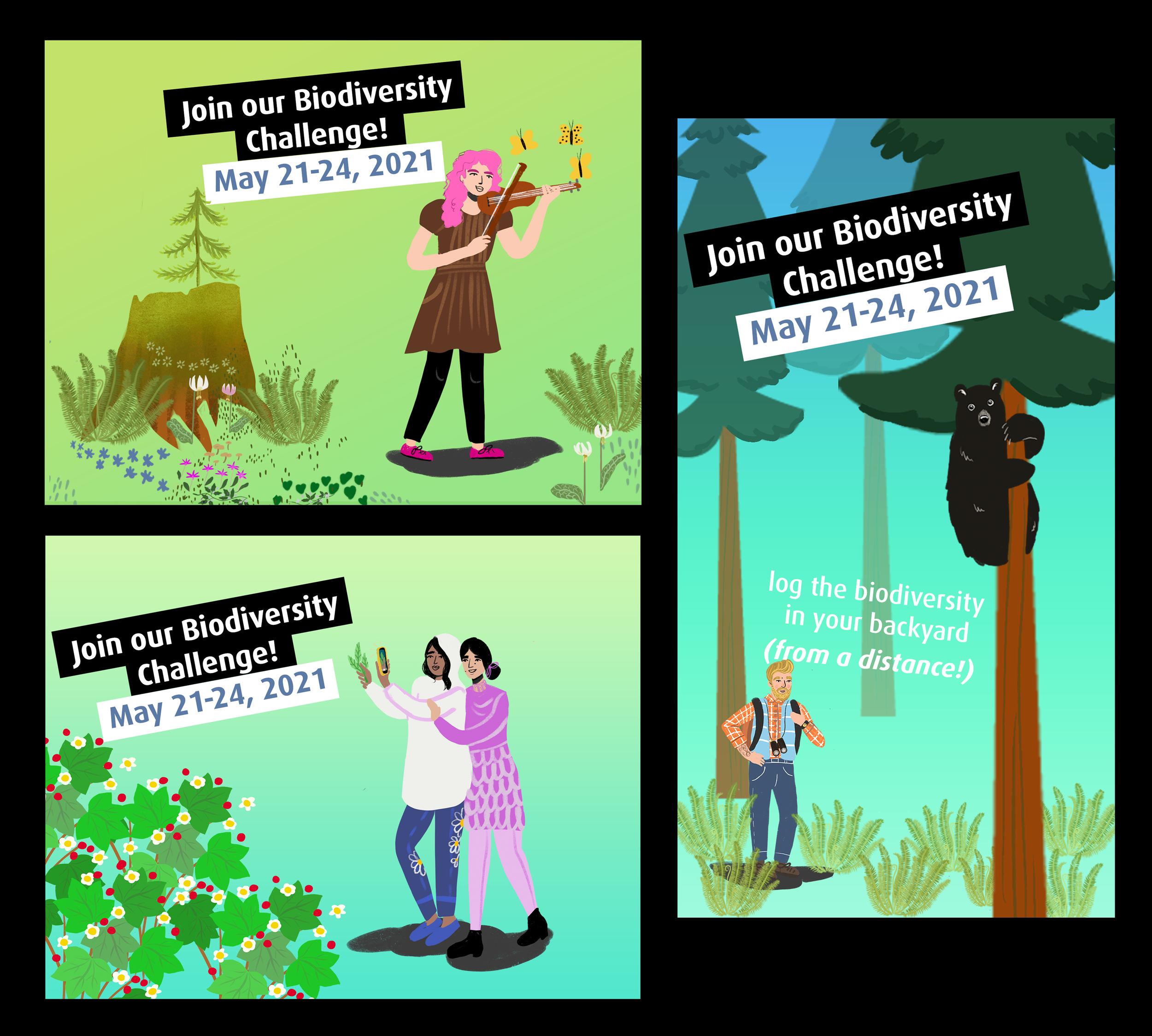
Below are some of my results, and an example of a campaign that it eventually got used it, for social media.

It's a Toilet, not a Trashcan - Don't flush weird stuff down the toilet!

As part of an effort to stop the public from flushing disinfectant wipes and other non-poop, pee, blood stuff, I created the concept for a series of ads for the Capital Regional District, along with the CRD Environmental Services department. These ads were shown as movie theatre posters & mirror stickers, traditional ads, web ads and YouTube pre-roll.

The creative inspiration for this ad was to play with the idea that people often like to draw with marker in public toilet stall, so the text here is illustrated in a marker style.

The base image was chosen after looking at hundreds of toilets on stock (I can tell you WAY too much about toilets now! For example, did you know that the curving pipe shape at the side of some toilets make some people uncomfortable?) and then applying the illustrations with Procreate on the iPad with an Apple Pencil. Later, the procreate images were traced in illustrator to turn them into vector images, so that we could work with infinite scalability but still keep that sketchy style.

Awesome actor Sean Tabares gave his voice to the pre-roll! He’s the best. IG @seantabares

I’m grateful the CRD gave me the creative room to play with different media, including this hand-animation using Procreate. This was part of an instagram story.

What it looks like to work in onion layers in Procreate animation mode (below).

iNaturalist Biodiversity Challenge 2021

In 2021 I was I had the privilege of participating in the promotion of the Capital Regional Districts new exploration of using iNaturalist to encourage community awareness about biodiversity as part of the Environmental Protection department. This was also the first time that were able to use instagram to it’s full potential, by using not only instagram and Facebook, but instagram stories as well.

Note: This was part of my work as part of the capital regional district (the regional government in southern Vancouver Island). To view other corporate items, view my graphic design portfolio.

Forest at night - Fireflies - A love letter to humid southern Ontario summers

I love the west coast, but every year I find I become nostalgic for the moody Windsor summers of my youth.

Oct 20, 2022 update: I’ve made a version of this memory with it’s companion daytime print. :)


My family would pack up the flat trailer and camp around southern Ontario — my favourite place of all was Wheatley Provincial Park. My sister and I would follow secret paths along the water, and venture out onto fallen logs. I’d imagine a world where I never went back. I would lay in a hammock strung from tree to tree and sketch the leaves over my head. (Thinking back on it, that child would think what I’m doing now is pretty amazing!) On a particularly lucky night we would get to see the most magical thing of all, fire flies.

This image is for my sister, here she is carrying her favourite stuffed animal, Giraffee the giraffe. (Mine was a little turtle named George, I still have him.)

We are purposely small here, surrounded by a dark but not ominous forest.

I think I’m realizing that I like it best when the people dwarfed by the natural world around them.


Screen Shot 2021-07-27 at 10.34.21 PM.png