
Design trends evolve around a push and pull between what's new and interesting versus classic and essential. How to grab attention in a novel way, how to scale back and what's unnecessary. How to reward users with the type of stimulus they crave. Nothing demonstrates this more than the recent trends in design. Here are my top ten, in no particular order.
TREND #1 & #2: BIG & SHOWY
(i.e. HUGE BACKGROUND IMAGES & VIDEO)
Beautiful image background as a still shot...
For this first group of trends, we're talking about a couple different things: Photography / huge images / SVG & video backgrounds.
Trend #1: Huge Background images. SVG.
The increasing of pixel density per screen has been happening gradually, year by year. With the launch of Apple’s retina iMac, scalability of the image has become a major concern for the designers globally. Some designers are turning their attentions towards SVG and other types of vector images, which are all attractive, light, and scalable. In this vector format, your assets look crisp and nicely adapt to any screen size. In addition to that, SVG elements can be beautifully animated and make your site feel alive.
SVG Pros
• SVG graphics do NOT lose any quality if they are zoomed or resized
• Every element and every attribute in SVG files can be animated
• SVG is a W3C recommendation
• SVG images can be printed with high quality at any resolution
SVG Cons
• If your design must be rendered in IE8, you need another vector fallback or not use vector at all, and instead rely on responsively sized images.
(pros & cons credit:insight180)
Warning about SVG: Do not make designs so heavy that it takes too much time to load!
This trend in print....
Already a huge trend in web, large image design has bled into print. High-quality photography and illustrations add excitement to print design. Unlike web design, there's no technological or practical reason why this trend has become adopted, other than to follow the lead of the web (and, honestly, what print designer hasn't wanted an excuse to use a really beautiful image?)
Large image design (notice a version of a web design trend, ghost buttons, exemplified here)
#2 Video BACKGROUNDS
Looking to kick it up past high quality images with something really showy? Look to GIF and videos (and soon, the implications of 3D videos). "Balancing the intricacies of three-dimensional graphics will play an important part in the evolution of web design. You can also expect to see fully responsive HD-quality video backgrounds on many websites this year."*
This trend can work well in some sectors/applications – in others its gimmicky, so tread carefully. Below are examples of videos that have worked well and maybe not so well...
The good:
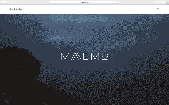
A look back at the Maaemo site, the background video is beautiful, non-distracting, elegant, on brand. (Below is a rough GIF of the site video, click the through link to visit the actual Maaemo site.)
Another good example would be: vine.co, which cycles videos in it's header and the format makes sense, given that video sharing is the essence of the site. The videos aren't high quality, but they are to the point.
The bad:
The background video had good intentions, but was not well executed.
This is subtle at first, but anyone who sits on this site for more than 10 seconds soon realizes how awkward these background videos are. They are clearly models doing awkward expressions, better suited to a satirical website. It's safer, if you're using people in your background video, don't have them face the screen, aim for a casual, semi-profile shot where they're doing an activity. For one, you can avoid the awkwardness here. Secondly, you can avoid the creep-out factor of a faux person looking directly at you. Thirdly, title text cutting across a face is never a good look.
A summary word of warning: be very VERY careful about how and what you choose to use as a background video. A distracting video can break the charade of an entire branding message.
TRENDS 3, 4 & 5: TYPOGRAPHY & BIG BLOCKS OF TEXT
For this big trend we're talking about Typography in general, as applied to the web, a typography sub-trend, and typography layout.
Typography is the language of the brand message and recently it has been gaining extra attention and importance.
Trend #3: WEBFONTS
Increasing democracy of typography in terms of improvement of webfonts such as Typekit and Google Fonts. They will replace/replicate the classics like Arial, Verdana, Georgia, and similar others. The result: beautifully designed and highly improved sites.
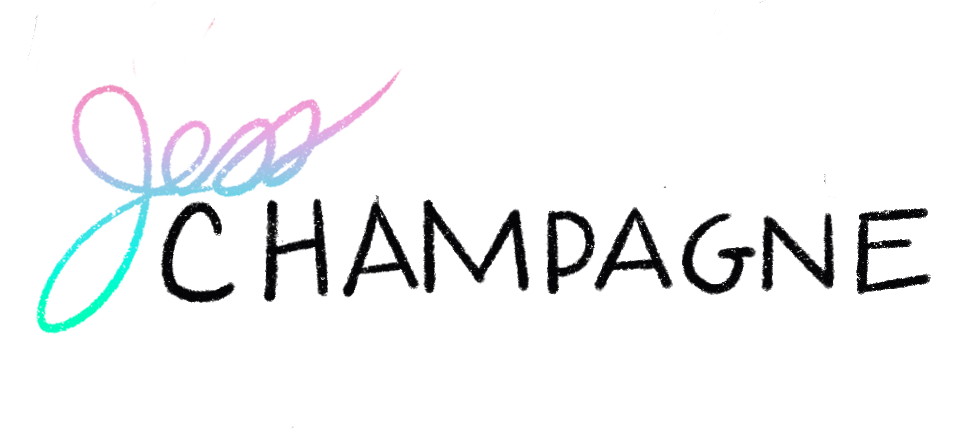
Trend #4: HANDDRAWN ELEMENTS & TYPOGRAPHY
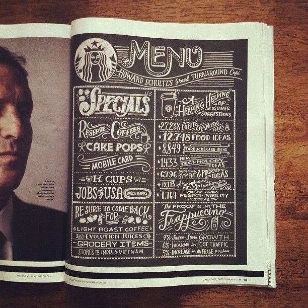
Hand drawn elements rebel against digital perfectionism. What better way to humanize a brand or company than through hand-drawn type?

"People seem to be more and more drawn back to what is real... exploring other cultures or our own family histories, or reconnecting with stories from mythology or our childhoods... By bringing back what is human-made, we gain a sense of control over the digital tide that threatens to overtake us.”* (Bill Gardner)
Don't confuse the rebellious nature of hand-drawn as being strictly anti-commercial, as it's been applied to many corporate marketing strategies to imply "hip-ness" as well.

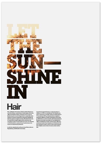
LAYOUT TREND #5: BIG BLOCKS OF TEXT
Using text as a visual element has been around forever, but utilizing font choices and size to create clean, simple, and elegant visual hierarchy that reads as information and eye-candy has emerged more fully during this generation of designs less is more aesthetic.
BIG TREND #6 & #7: MINIMALISM
Minimalism AND EVOLVED RESPONSIVE DESIGN
The point of minimalism is to leave only what is needed to convey what you need to convey, or to make an impression. Ideally impactful but sparse information, often paired with showy photographic, video or illustrative elements. (See Maaemo example above.)
TREND #6: MINIMALISM ACROSS PRINT AND WEB
It is suggested that 2015/2016 will see designers slashing and rebuilding their sites.
Both websites and printed pieces will focus more on how to regain their free space, put impressive images, and utilize their robust typography.
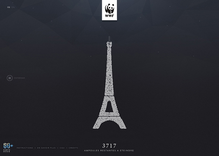


Above: Minimalism in design.
TREND #7: EVOLVED RESPONSIVE DESIGN
I consider responsive design to be related to minimalism in that the end product tends to be able to scale something larger and often cluttered, down to it's most essential form at it's smallest.
Responsive design has been the #1 trend of the last few years, as highly advanced mobile phones and this new thing called iPads came into prominence.
This year, we speak of “Evolved” Responsive web design and card-based design.
Creative director Haraldur Thorleifsson says card-based design will be big:
"Content needs to fit on different types and sizes of screen, and cards are the easiest way to make that work across platforms." This can be a challenge because cards can be dull, "but we're seeing fun, clever takes on this from companies like Google."
"We are currently witnessing a re-architecture of the web, away from pages... towards completely personalised experiences built on an aggregation of many individual pieces of content. Content being broken down into individual components and re-aggregated as the result of the rise of mobile technologies... and unprecedented access to data from all kinds of sources ... This is driving the web away from many pages of content linked together, towards individual pieces of content aggregated together into one experience." Intercom
See link for more info on card-based design.
Responsive design will have to go further, not only to remain interesting, but to scale and change to adapt to new devices such as wearable devices like watches. Providing a seamless experiences across all channels becomes very important.
BIG TREND #8: FLAT DESIGN
AKA ILLUSTRATION STYLE WARS: FLAT DESIGN vs. REALISM
When I went to write this article, I decided to, for once, talk to real people around me, to get a sense of what other people actually thought. So what happened when I asked one web developer, and one teenage niece, exactly what they thought were current trends in design? They had one answer: Flat, flat, flat. Yes, that rebellion against the detailed, the shaded, the shiny... also known as flat design.
Yes, it's true, flat design is trending right now. While flat design draws its influence from various styles of art including: swiss style, minimalism and the styles emerging from Bauhaus, it can be said that it was Apple’s 2013 release of IOS 7 that really made flat design “mainstream” *
Currently it can be seen in Windows 10, IOS8, Android M. What does it look like? Flat colors, simple object graphics. Simplistic. It's the anti-glossy buttons. Why? Some like the look better. Others will cite that it's scalable, manageable, practical. Made with functionality in mind.
It can, however, be interpreted in different ways such as subtle gradients, textures and photos.
TREND #9:
GHOSTLY DESIGN & GHOST BUTTONS
Made mainstream by IOS 7, “ghosty” design is something seen regularly in Hollywood and across mediums. It's minimal and futuristic, with a light touch. It marries especially well with moody photography.
Ghost titles and buttons are an element that pairs perfectly with an interesting SVG or video background, ghost buttons float above the focus and add elegance.
Tips: In terms of web applications, some argue ghost buttons especially are against basic marketing techniques because they are not bold enough and they may be overlooked by a user. Their usage is highly dependent on design & application... Ghost buttons work especially well when the only action required is the one that the button offers (see example below).
Note: If color contrast are not complementary and the button itself is not big enough to catch the eyes then ghost buttons can make a problem with conversion optimization.
BIG TREND #10: SCROLLING DEFEATS CLICKING
With the increase in use of mobile devices to surf the web, users have become accustomed to scrolling & side-swiping. Many would say that scrolling has won over clicking. The reason for this change is that an online audience wants to get a preview of all you have to offer right on the first page.
In recent web design trends, home pages grow longer (usually 'below the fold') in order to create a dynamic interaction between the website and the viewer.
Tips: Scrolling is not a pure winner. Scrolling can quickly get confusing and disorienting for websites with important text. (Think government sites.)
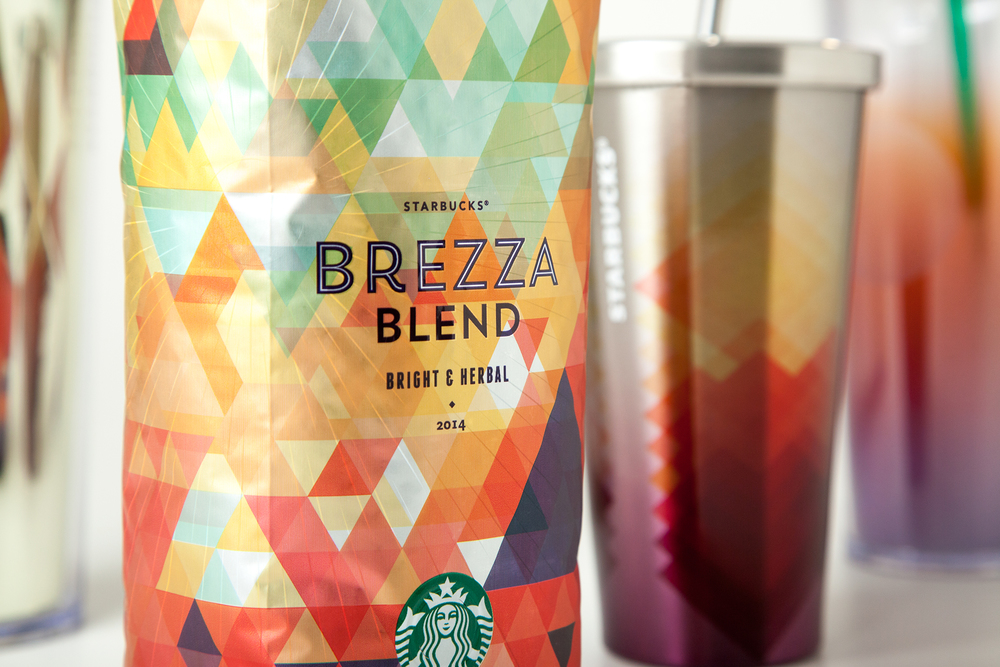
BONUS Mini-TREND: GEOMETRIC STYLING
A continued trend from the past few years is the embracing of geometric often contrasted with the organic. In a way, geometry is the design marriage of "rebellion" and "minimalism". Flashy without rebelling too much. There's something comforting and orderly about geometry (obviously) that is appealing, especially to brands that want to intuit order, responsibility, knowledge, wisdom, and technology. Geometry can be also be fun vehicle for playing with color.
How long will this trend stick around? It's hard to say. Some sites and brands that were playing with geometry last year have either moved on a parallel trend or a simpler layout (tiling), yet some brands are just beginning to play with geometry. I suspect, as noted above, that brands where it makes obvious sense to play with geometry in their design will continue to use geometric designs for a longer period than brands who just want to try something new and then move on.

There are many more trends to discuss, but they are best left for another post.
WEB: Tiling, Mashup, Javascript/CSS. Digital Branding. Designer automation. PRINT: Intricate designs like Knit, Movement lines and waves, Use of color and more on hand drawn type.
Thanks for reading!