Feed the land, not the landfill

This spring I got the opportunity to work on a kitchen scraps guide for the regional government, and now I can finally share! This guy is meant to be added to and distributed by local collectors, but is super handy for anyone too. (Contents might vary by area though!)

I loved getting to draw unique icons for each item, some were required to be super specific. See pics below.

TOP TEN DESIGN TRENDS For 2016

Last year's design trends generated a lot of interest, so by popular demand, here are the Top Ten Design Trends for 2016! 

THE Natural Hero 

Previous years have seen trends go towards hand-drawn headers, animation, textures, architectural elements, and many more. But this year is the celebration of natural beauty, in the trend towards beautiful high-quality nature-theme photography headers. 

It certainly makes sense, as I mention later, User Experience (UX) is essential this year, and nothing instills a positive mood better than nature. They appeal to our us in an essential way, and studies have proven that just a few minutes in nature improves our blood-pressure and our sense of wellbeing. In our increasingly artificial world, many of us are a little nature-deprived, thus making natural images all the more potent. 

Airbnb

Airbnb

Screen Shot 2015-12-29 at 9.56.55 PM.png


HERO IMAGES 

Hero images* are nothing new, they've been climbing in prominence since last year's list. 

A hero image is a large banner image, prominently placed on a website, front and centre.[1][2]It is usually the first visual a visitor encounters on a website, and showcases the most important info. 

But a wider access to high quality photography and ever-improving technology such as bandwidth speeds and compression) will only make them more prevalent. Now users can be treated with high quality images (and video!) without suffering.

"People are tired of cheesy looking stock photos and stock photo disruptors like Unlash, Stocksy and Death to the Stock Photo and Offset are providing a solution - natural looking stock photos that connect with people on a whole different emotional level. In 2016, we'll be seeing more amazing photos implemented in websites."(7)
 

#3 VIDEO VIDEO VIDEO

Video made my list last year, but I'm still surprised at the extent to which it seems to be popping up everywhere. Companies are really deciding to rely on high-internet speeds. When you think of the internet even just 15 years ago, a move to video as a website background is a BOLD move. Almost unbelievable. 

Screen Shot 2015-12-29 at 10.18.52 PM.png

#4 COLOR

One bold move in hand with another: colors are back more than ever. 

Screen Shot 2015-12-29 at 10.17.28 PM.png

Color is highly influential, communicating emotional energy and effecting how we perceive objects. 

Color forecasts for spring trend distinctly bold: 

instyleparis

instyleparis

 "Color works because it’s straightforward and powerful."

Medium

Medium


We’re seeing more and more use of RGB color. RGB provides a much more saturated, rich way of presenting color that brands are really having fun with.

Connie Birdsall(5)

Spotify

Spotify

I think the biggest shift will be in the use of the color, where we’ll see more of a departure from the 60s era color palettes and evolve into the richer colors used in the last two decades of the 20th century.Joel Kreutzer, head of design at Archrival(5)
 

#5 METALLICS

Metallics are spreading across design and fashion, and, this year, digital landscapes.  

The breakout star of 2016 is going to be metallics, and — given their ability to instantly bring a sophisticated and glamorous touch to any space — it’s not hard to see why. Whether adding a sleek touch with silver or chrome or warming a room with gold, rose gold or copper, every school of design can benefit from this trend.” (10)

Harpar's Bazaar

Metal does seem like an odd trend, because recreating them digitally is not as easily accomplished as other types of colour and texture trends. On the graphic end, it's hard to achieve a metal look well and very easy to go overboard and look tacky. 

I predict you'll see metal twinkle in websites through photography and products and very slight touches of metallic illustration.

Apple.com - showcasing a mix of product photography and metallic illustrated elements. 

Apple.com - showcasing a mix of product photography and metallic illustrated elements. 

What is unique about metals in late 2015 and 2016 is the mix: you'll see a variety of metals mixed together.

Squarespace.com, using video as a background with metallic objects.

Squarespace.com, using video as a background with metallic objects.


#6 Rise of UX

UX is key to website success. Yet most of those in management roles have still never heard of UX. This year UX will make a leap, as the need for good UX is becoming clear across all types of websites. 

"Startups and big business alike now view strong UX as a key differentiator. In 2016 expect to see increased demand for UX design from government and social services. While this complex work might be seen as less glamorous, the need is essential and the impact will be substantial. (8)"

 If you've ever tried to navigate a government website, you'll be excited about this trend. 

One type of UX we'll see more of is 'micro interactions':

"We' be seeing more of micro user experience (UX) in action. This trend will be disrupting industries where websites are not that fun to use like airlines, banks, health care, finances and more. Think of funny images, expressions, hidden functionality, smart personalized data and more.(7)" 

At the same time, while UX finally travels into no-mans land, the nature of UX will be changing in 2016. No longer focused on playing with pixels, UX design will focus on more abstract elements:

Robust and comprehensive interaction design pattern libraries are gradually letting us focus our time on what really matters for the user: getting things done in an easy and familiar way. (14)


#7 Hamburger menus

Hamburger menus, you'll see these little guys in the upper corner of websites, usually paired with a hero image. They're all little bit of a wallflower, and as long as they become ubiquitous enough that a user knows to seek them out, they're generally a good idea. However, bring up hamburger menus and watch designers brawl. 

Some warnings:

  • If your site isn't designed well, then hamburger menus become a problem.(12)  and
  • There is a definitely age gap. Many in the generations before Millenials and Generation Y will have a hard time adapting to these. 
  • There are rumblings that the hamburger menu may become replaced by Apple's investment in 3D Touch (9b)
See the tiny three lines in the upper right corner?

See the tiny three lines in the upper right corner?


#8 GEOMETRICS 

The current trend in geometry is a natural balance to the #1 trend, Natural photography.  Recent trends in geometry have spilled into all forms of art and fashion. 

"When it comes to adding visual interest to a room, there’s no easier way to make an impact than by adding a few geometric shapes. The recent interest in these shapely designs is a continuation of the ’70s-inspired trend that has been turning heads."(11)

Geometry in websites have been trending since 2013 (9) and this year, with geometry infiltrating fashion, we'll only see it more in websites looking to gain attention. (6)


#9 & #10 Minimalism & Ghost buttons (continued)

With advances in technology happening all the time, it can be an easy trap to try to fit every possible advancement all into one page. But it's the good designers job to pull a client a step or two back towards minimalism. As some fight for attention through a myriad of attention-grabbing methods, minimalism will continue to be the everlasting trend to balance out those urges. Minimalism is always in style, never tacky. 

"Minimalism inspired a raft of sites that are clean, fast and easy-to-use." Minimalism will stick around as long as efficient, cost-effective websites are valued. 

Minimalism also brings much needed breathing space to a website, known as "White space". White space is a key element in any design project, whether digital and traditional, and these days it's in short supply. 


Ghost buttons return from last year as they continue to be trendy among websites with dark themes.  This Haruki Murakami site is especially well-suited to using the Ghost Button.


In summary, the above are a list of ten design trends of 2016, but they are by no means exhaustive. There were many more topics that I couldn't cover, such as long scrolling, updates in responsive design and the other more technical aspects of web design, which I may cover in a another post. 

So what do you think of this year's list? What trends do you think will dominate 2016?


Jessica Champagne is a graphic & web designer, author and communications expert who lives in beautiful Sooke, BC, Canada. 

References

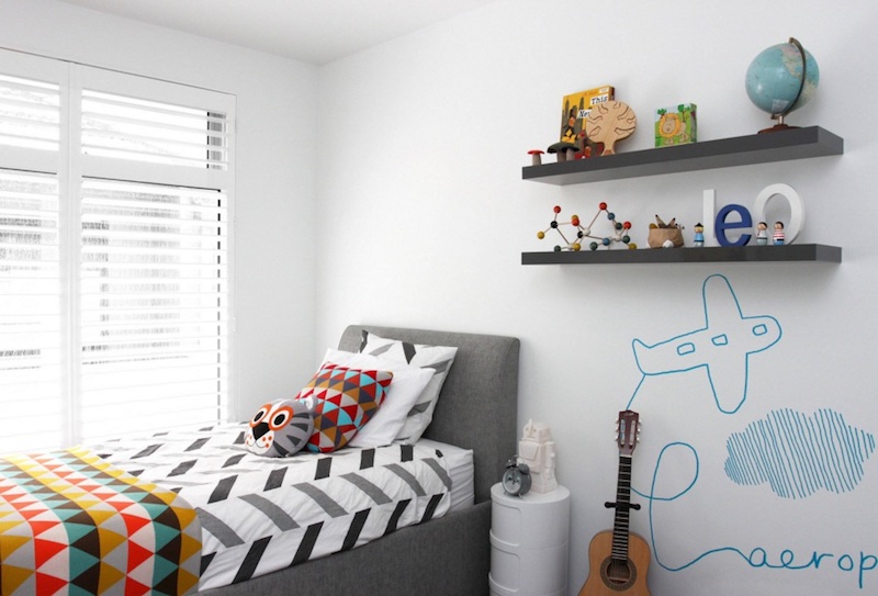
(1) Berman, M. G., Jonides, J., & Kaplan, S. (2008). The cognitive benefits of interacting with nature.Psychological Science, 19(12), 1207-1212.

(2) Bowler, D. E., Buyung-Ali, L. M., Knight, T. M., & Pullin, A. S. (2010). A systematic review of evidence for the added benefits to health of exposure to natural environments. BMC Public Health, 10, 456.

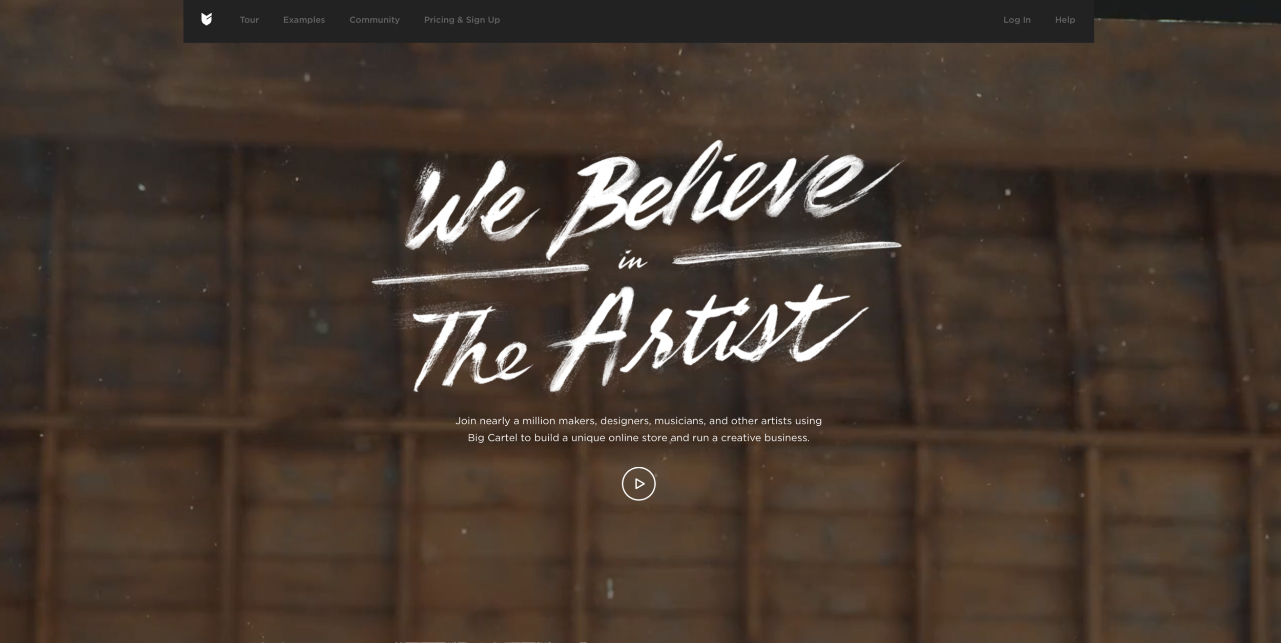
(3)https://en.wikipedia.org/wiki/Hero_image

(3b)http://line25.com/articles/30-web-designs-that-fully-embrace-the-hero-image

(4)http://www.awwwards.com/6-web-design-trends-you-must-know-for-2015-2016.html

(5) http://www.howdesign.com/resources-education/graphic-design-trends-2016/#sthash.omcroDKv.dpuf

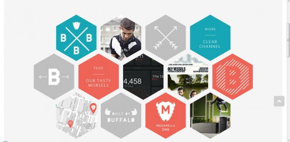
(6)https://www.pinterest.com/annwu0114/geometric-trend-2016/

(7) http://www.forbes.com/sites/tomaslaurinavicius/2015/12/28/web-design-trends-2016/

(8) http://www.howdesign.com/resources-education/graphic-design-trends-2016/#sthash.omcroDKv.dpuf

(9) http://www.awwwards.com/50-awesome-websites-with-extraordinary-geometry-elements.html

(9b)http://thenextweb.com/opinion/2015/09/14/apples-plan-to-kill-the-hamburger-menu/

(10/11)freshome.com/2016-design-trends/

12)www.awwwards.com/be-careful-about-these-6-web-design-trends-in-2016.html

(13) http://www.howdesign.com/resources-education/graphic-design-trends-2016/#sthash.omcroDKv.dpuf

(14) http://uxdesign.cc/ux-trends-2015-2016/

TOP TEN DESIGN TRENDS FOR 2015 & 2016


Design trends evolve around a push and pull between what's new and interesting versus classic and essential.  How to grab attention in a novel way, how to scale back and what's unnecessary. How to reward users with the type of stimulus they crave. Nothing demonstrates this more than the recent trends in design. Here are my top ten, in no particular order.

TREND #1 & #2: BIG & SHOWY  
(i.e. HUGE BACKGROUND IMAGES & VIDEO)

Beautiful image background as a still shot... 

For this first group of trends, we're talking about a couple different things: Photography / huge images / SVG & video backgrounds.

Trend #1: Huge Background images. SVG. 

The increasing of pixel density per screen has been happening gradually, year by year. With the  launch of Apple’s retina iMac, scalability of the image has become a major concern for the designers globally. Some designers are turning their attentions towards SVG and other types of vector images, which are all attractive, light, and scalable. In this vector format, your assets look crisp and nicely adapt to any screen size. In addition to that, SVG elements can be beautifully animated and make your site feel alive.

SVG Pros

•   SVG graphics do NOT lose any quality if they are zoomed or resized

•   Every element and every attribute in SVG files can be animated

•   SVG is a W3C recommendation

•   SVG images can be printed with high quality at any resolution

SVG Cons

•   If your design must be rendered in IE8, you need another vector fallback or not use vector at all, and instead rely on responsively sized images.

(pros & cons credit:insight180)

Warning about SVG: Do not make designs so heavy that it takes too much time to load!


This trend in print....

Already a huge trend in web, large image design has bled into print. High-quality photography and illustrations add excitement to print design. Unlike web design, there's no technological or practical reason why this trend has become adopted, other than to follow the lead of the web (and, honestly, what print designer hasn't wanted an excuse to use a really beautiful image?)

Large image design (notice a version of a web design trend, ghost buttons, exemplified here)


#2 Video BACKGROUNDS

Looking to kick it up past high quality images with something really showy? Look to GIF and videos (and soon, the implications of 3D videos). "Balancing the intricacies of three-dimensional graphics will play an important part in the evolution of web design. You can also expect to see fully responsive HD-quality video backgrounds on many websites this year."* 

This trend can work well in some sectors/applications – in others its gimmicky, so tread carefully. Below are examples of videos that have worked well and maybe not so well...


The good:

A look back at the Maaemo site, the background video is beautiful, non-distracting, elegant, on brand. (Below is a rough GIF of the site video, click the through link to visit the actual Maaemo site.) 


Another good example would be: vine.co, which cycles videos in it's header and the format makes sense, given that video sharing is the essence of the site. The videos aren't high quality, but they are to the point.


The bad:


The background video had good intentions, but was not well executed.

This is subtle at first, but anyone who sits on this site for more than 10 seconds soon realizes how awkward these background videos are. They are clearly models doing awkward expressions, better suited to a satirical website. It's safer, if you're using people in your background video, don't have them face the screen, aim for a casual, semi-profile shot where they're doing an activity.  For one, you can avoid the awkwardness here. Secondly, you can avoid the creep-out factor of a faux person looking directly at you. Thirdly, title text cutting across a face is never a good look.

A summary word of warning: be very VERY careful about how and what you choose to use as a background video. A distracting video can break the charade of an entire branding message.


TRENDS 3, 4 & 5: TYPOGRAPHY & BIG BLOCKS OF TEXT

For this big trend we're talking about Typography in general, as applied to the web, a typography sub-trend, and typography layout.

Typography is the language of the brand message and recently it has been gaining extra attention and importance.

Trend #3: WEBFONTS

Increasing democracy of typography in terms of improvement of webfonts such as Typekit and Google Fonts. They will replace/replicate the classics like Arial, Verdana, Georgia, and similar others. The result: beautifully designed and highly improved sites.


Trend #4: HANDDRAWN ELEMENTS & TYPOGRAPHY

Hand drawn elements rebel against digital perfectionism. What better way to humanize a brand or company than through hand-drawn type?


"People seem to be more and more drawn back to what is real... exploring other cultures or our own family histories, or reconnecting with stories from mythology or our childhoods... By bringing back what is human-made, we gain a sense of control over the digital tide that threatens to overtake us.* (Bill Gardner)


Don't confuse the rebellious nature of hand-drawn as being strictly anti-commercial, as it's been applied to many corporate marketing strategies to imply "hip-ness" as well.


LAYOUT TREND #5: BIG BLOCKS OF TEXT

Using text as a visual element has been around forever, but utilizing font choices and size to create clean, simple, and elegant visual hierarchy that reads as information and eye-candy has emerged more fully during this generation of designs less is more aesthetic.


BIG TREND #6 & #7: MINIMALISM 
Minimalism AND EVOLVED RESPONSIVE DESIGN

The point of minimalism is to leave only what is needed to convey what you need to convey, or to make an impression.  Ideally impactful but sparse information, often paired with showy photographic, video or illustrative elements. (See Maaemo example above.)


TREND #6: MINIMALISM ACROSS PRINT AND WEB

It is suggested that 2015/2016 will see designers slashing and rebuilding their sites.
Both websites and printed pieces will focus more on how to regain their free space, put impressive images, and utilize their robust typography.

Above: Minimalism in design.


TREND #7: EVOLVED RESPONSIVE DESIGN

I consider responsive design to be related to minimalism in that the end product tends to be able to scale something larger and often cluttered, down to it's most essential form at it's smallest. 

Responsive design has been the #1 trend of the last few years, as highly advanced mobile phones and this new thing called iPads came into prominence. 

This year, we speak of “Evolved” Responsive web design and card-based design.

Creative director Haraldur Thorleifsson says card-based design will be big:
"Content needs to fit on different types and sizes of screen, and cards are the easiest way to make that work across platforms." This can be a challenge because cards can be dull, "but we're seeing fun, clever takes on this from companies like Google."


"We are currently witnessing a re-architecture of the web, away from pages... towards completely personalised experiences built on an aggregation of many individual pieces of content. Content being broken down into individual components and re-aggregated as the result of the rise of mobile technologies... and unprecedented access to data from all kinds of sources ... This is driving the web away from many pages of content linked together, towards individual pieces of content aggregated together into one experience." Intercom

See link for more info on card-based design.

Responsive design will have to go further, not only to remain interesting, but to scale and change to adapt to new devices such as wearable devices like watches. Providing a seamless experiences across all channels becomes very important.


BIG TREND #8: FLAT DESIGN

AKA ILLUSTRATION STYLE WARS: FLAT DESIGN vs. REALISM 

When I went to write this article, I decided to, for once, talk to real people around me, to get a sense of what other people actually thought. So what happened when I asked one web developer, and one teenage niece, exactly what they thought were current trends in design? They had one answer: Flat, flat, flat. Yes, that rebellion against the detailed, the shaded, the shiny...  also known as flat design.

Yes, it's true, flat design is trending right now. While flat design draws its influence from various styles of art including: swiss style, minimalism and the styles emerging from Bauhaus, it can be said that it was Apple’s 2013 release of IOS 7 that really made flat design “mainstream” * 

Currently it can be seen in Windows 10, IOS8, Android M. What does it look like? Flat colors, simple object graphics. Simplistic. It's the anti-glossy buttons.  Why? Some like the look better. Others will cite that it's scalable, manageable, practical. Made with functionality in mind.

It can, however, be interpreted in different ways such as subtle gradients, textures and photos.


http://www.flatvsrealism.com

TREND #9:
GHOSTLY DESIGN  GHOST BUTTONS

Made mainstream by IOS 7, “ghosty” design is something seen regularly in Hollywood and across mediums. It's minimal and futuristic, with a light touch. It marries especially well with moody photography. 


Ghost titles and buttons are an element that pairs perfectly with an interesting SVG or video background, ghost buttons float above the focus and add elegance.

Tips: In terms of web applications, some argue ghost buttons especially are against basic marketing techniques because they are not bold enough and they may be overlooked by a user.  Their usage is highly dependent on design & application... Ghost buttons work especially well when the only action required is the one that the button offers (see example below).

Note: If color contrast are not complementary and the button itself is not big enough to catch the eyes then ghost buttons can make a problem with conversion optimization.


BIG TREND #10: SCROLLING DEFEATS CLICKING

With the increase in use of mobile devices to surf the web, users have become accustomed to scrolling & side-swiping. Many would say that scrolling has won over clicking. The reason for this change is that an online audience wants to get a preview of all you have to offer right on the first page.

In recent web design trends, home pages grow longer (usually 'below the fold') in order to create a dynamic interaction between the website and the viewer. 


Tips: Scrolling is not a pure winner. Scrolling can quickly get confusing and disorienting for websites with important text. (Think government sites.)


BONUS Mini-TREND: GEOMETRIC STYLING

A continued trend from the past few years is the embracing of geometric often contrasted with the organic. In a way, geometry is the design marriage of "rebellion" and "minimalism". Flashy without rebelling too much. There's something comforting and orderly about geometry (obviously) that is appealing, especially to brands that want to intuit order, responsibility, knowledge, wisdom, and technology. Geometry can be also be fun vehicle for playing with color.

How long will this trend stick around? It's hard to say. Some sites and brands that were playing with geometry last year have either moved on a parallel trend or a simpler layout (tiling), yet some brands are just beginning to play with geometry. I suspect, as noted above, that brands where it makes obvious sense to play with geometry in their design will continue to use geometric designs for a longer period than brands who just want to try something new and then move on.


There are many more trends to discuss, but they are best left for another post. 

WEB: Tiling, Mashup, Javascript/CSS. Digital Branding. Designer automation.  PRINT: Intricate designs like Knit, Movement lines and waves, Use of color and more on hand drawn type.


Thanks for reading!


Plunging back into GIFs + Animated GIF tutorial.

Slate's recent article on GIFs as Fine Art reminded me that I wanted to start a post on gifs (or, more specifically, 'animated gifs'). Remember these? Here's what animated gifs were like when they first came around!

These days, many people think of animated gifs as a means to express emotions or humour online, though they can actually be quite beautiful or subtle, depending on the intent. 

Find below some examples of my favourite modern gifs, as well as a tutorial for creating animated gifs and my very own first attempt at an animated gif! 

Above is a beautiful GIF by artist Sam Cannon. (As an aside: there are many examples of modern / retro technology applied as fine art. See here, and here, for two pulled off the top of my head.) 


Some of my favourite GIF artists below.

Rebecca Mock


Cyndi Pop  .


Here's my first attempt at a (not-so-simple) animated gif, using video captured on an iPhone at the University of Victoria (Victoria, BC) during the spring. I added the "Spring" text in photoshop. The font is Jellyka Princess. 

A sample tutorial for How to Make an Animated Gif 


Next goal: a cinema graph, which is, in essence, an animated gif whereby most of the image is still and only a portion moves, sometimes producing an effect which can be quite creepy! (Tutorial here.) The Rebecca Mock one above might technically be a cinegraph. 


HACKING traditional design stereotypes

Traditionally hospitals are designed to be 'soothing', bland places. Faced with often a struggling budget (especially for public hospitals) they tend to err towards safe design, which is why it's so refreshing to see a change away from that. 

My designer sister drew my attention to this children's hospital design on Facebook recently and I thought I should share it.  Below are just a few photos from the London Royal Children's Hospital, a collaboration done by 15 artists. My favourite is, of course, by one of my favourite designers, Tord Boontje. Click the link below if you want to check out all the photos.

(Original url: http://www.boredpanda.com/artists-mural-design-royal-london-children-hospital-vital-arts/) 

Design for special places and special people: 

I have always thought the design of hospitals and sanctuaries to be an interesting challenge for interior designers and architects. One of my favourite examples comes from architect Alvar Aalto in the design of the Paimio Sanitorium, which he designed specifically with tuberculosis patients in mind and keeping in mind both the need for peace and quiet, sun, and the fact that patients would spend most of their time horizontally. (I would really need a separate post to truly do this topic justice). It is a great example of how design itself can be a tool for healing. 

The importance of design in environments becomes more challenging when pain / stress / sickness is involved and even more important, in my opinion, when children are involved. I think that these design elements can play an important part in improving morale in hospitals not only for the patients but also for the workers. 

One particularly important design element for children, I believe, is animals. I noticed that even in our local hospital (Victoria General) there are some small efforts to add animals and designs to the hospital for children. In the Emerg stall for children (separated slightly from most of the emergency stalls separated only by curtains) the stalls look similarly monotone and plain unless you take a second to look up. Instead of white on the ceiling there is a circular mini murals depicting turtles and orcas, an interesting balance of keeping the walls neutral ("peaceful"?), but the ceiling cheerful and distracting. Certainly this was thought by a smart interior designers that many patients will probably spend a lot of time in bed, and thus look upward at the ceiling. 

This photo below depicts are more flamboyant animal design in the children's wing of a hospital. Animals certainly help kids feel as if they are in a more loving, cheerful, soothing place, and anyone who has spent time around a child that may need to be distracted for a moment or two (for example, to put in an IV) can attest to the power of having a task for them to do, a green butterfly to find, for example. 

“Alluding to renewal and growth, the work contains animals and elements in energising colours for children to find and discover. The larger drawings are very finely detailed and invite you to discover new elements day after day”

As a brief conclusion, I would love to see more examples of great design with patients, especially children, in mind, in local projects.