

Hey guys,
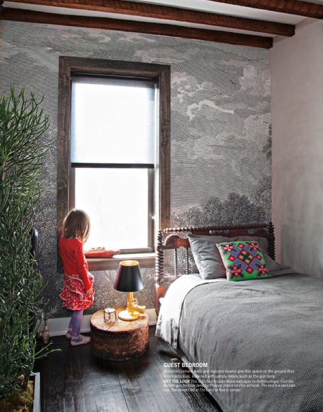
I tend to get a lot of questions about my bedroom mural and so here’s my follow up post. Here are some current pics I took this morning (these photos aren’t staged/cleaned), you can see my little Covid gym at the side, a blue blanket for my big dog* and a princess pillow for my lovely cat.*
TLDR: It’s held up perfectly! No change at all. Don't regret at all. Generally, I really love that wallpaper & wallpaper murals are now less messy, cheaper and more accessible to everyone thanks in part to the internet. Read below for details about delivery, design choices and downsides.
Here was my original post & installation.
You can find this mural here (no this post isn’t sponsored!)

I like my gym space corner to look classy apparently. Complete with olympic weight bars, foam roller, neck stretch pillow, marble rolling pin that I use for sore quads, and a very special wooden pole from my suspended camera set up DIY that DID NOT FIT so now I use it for stretching and things, and generally being prepared for night intruders.
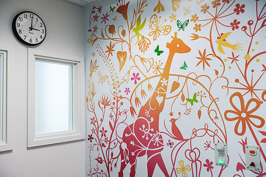
Getting this thing:
I eyed this mural for a LONG time. YEARS. One, it was $$$. How do I justify that to a partner? Two, a wallpaper mural can feel like a huge commitment — what if I didn’t like it after a few months? So I thought about it for a LONNG time. Then one Black Friday it was on sale for 30% off, and I decided to take the plunge. Great right? Not so fast.
The most complicated aspect of this mural was actually getting it, as Anthropologie wouldn’t deliver it here. They kept cancelling my order without details and I kept trying to figure things out with them because I was really adamant about trying to score the more affordable price. Despite their website saying it could come to Canada, something on their end wasn’t allowing it. So eventually I gave in and had to figure out an alternate way, so I had to deliver it to a relative in the US and beg my relative bring it up the traditional way.
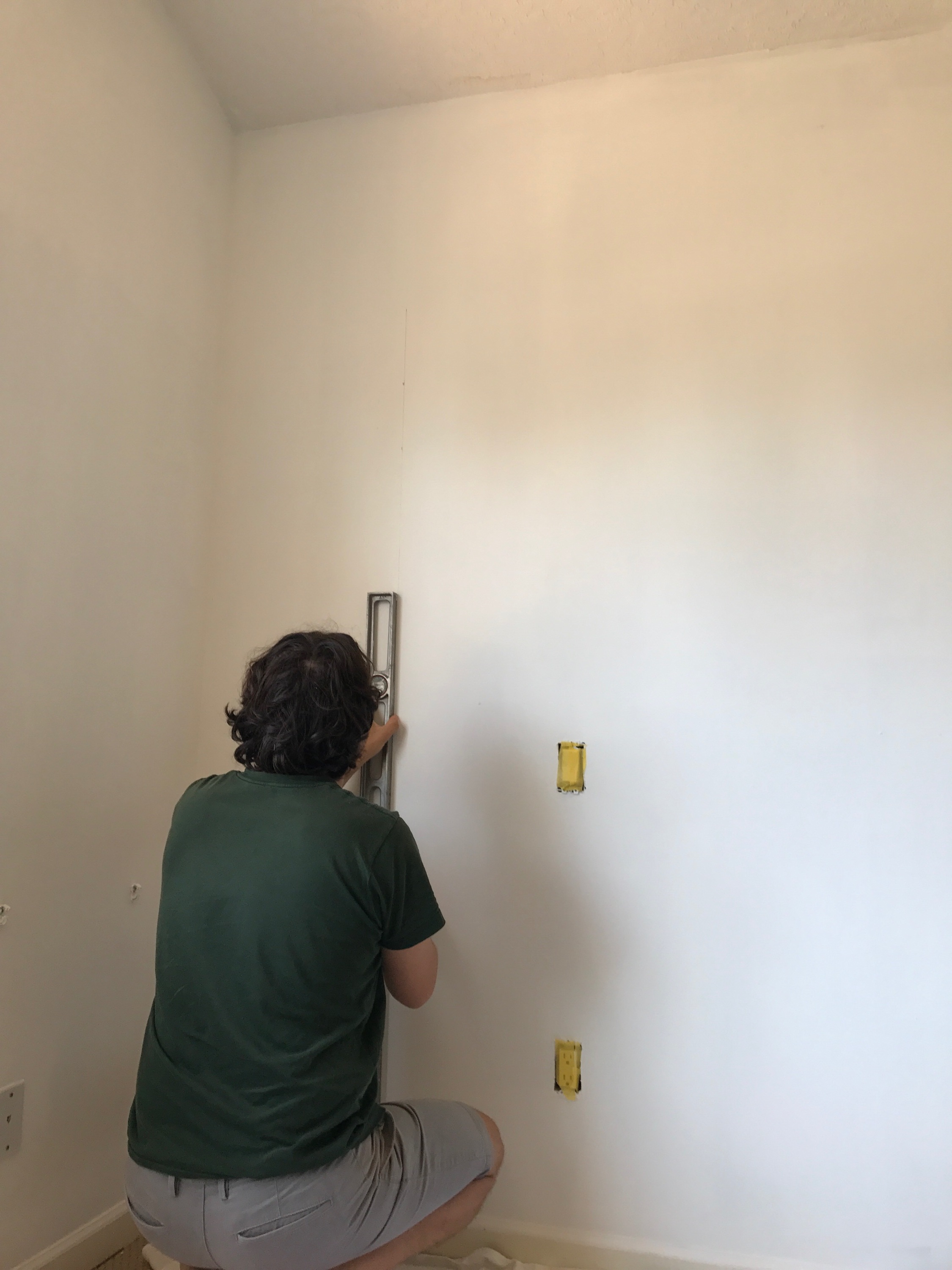
In terms of installation, it was pretty easy going up if you prep. And once it’s up, the seems are VERY hard to spot unless you’re purposely looking for them. (See below.)

Design:
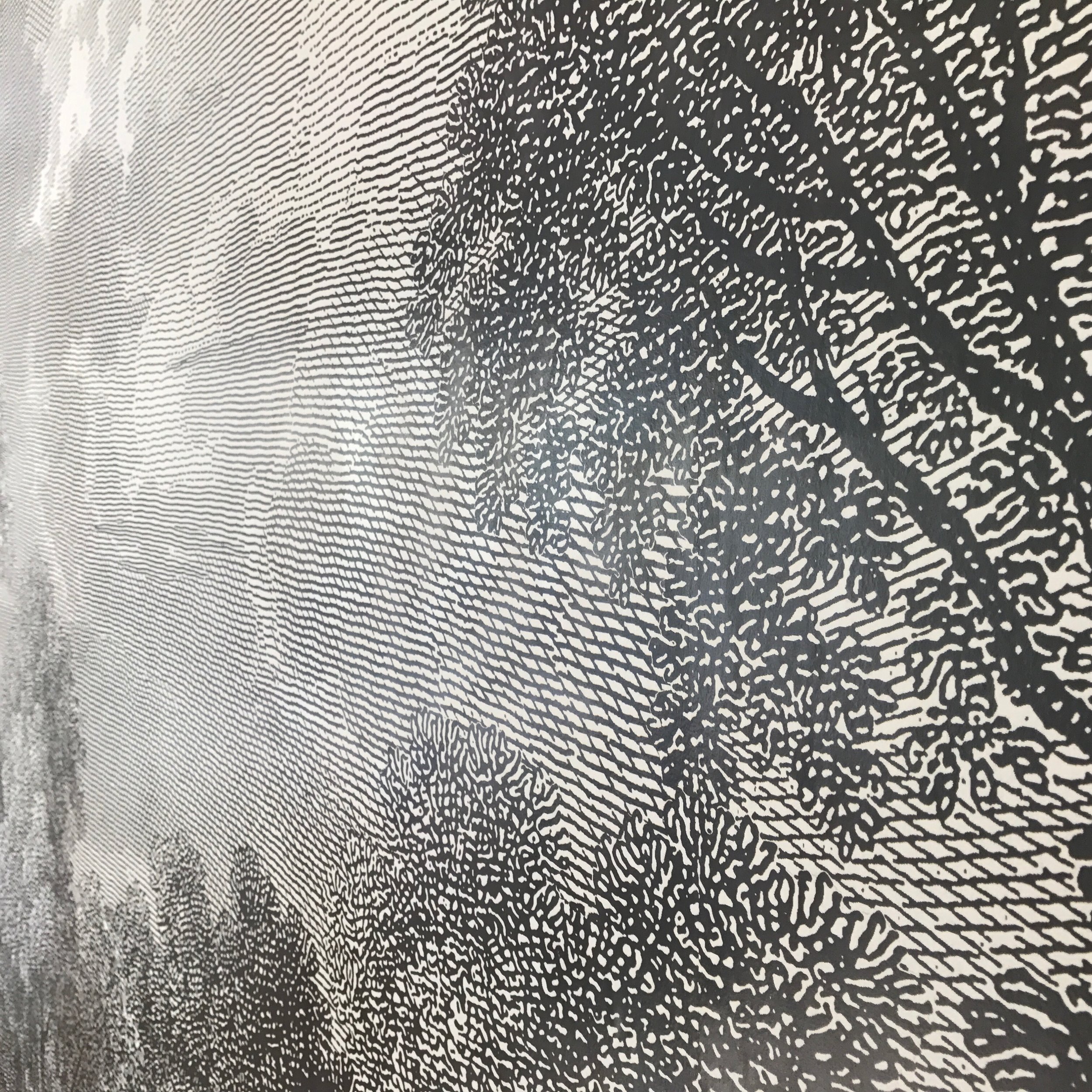
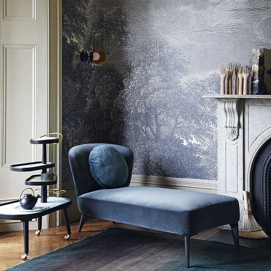
What I love about this style in particular is it’s both whimsical and grown up, it feels like sleeping in a fairy tale book, like old etching illustrations. It’s sort of neutral in a masculine way, but the trees have a slight romantic vibe. In terms of murals, the more up close pixelated style is very forgiving if you’re the type of person who wants to put up photos or otherwise cause holes.
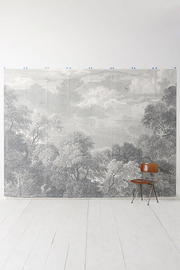
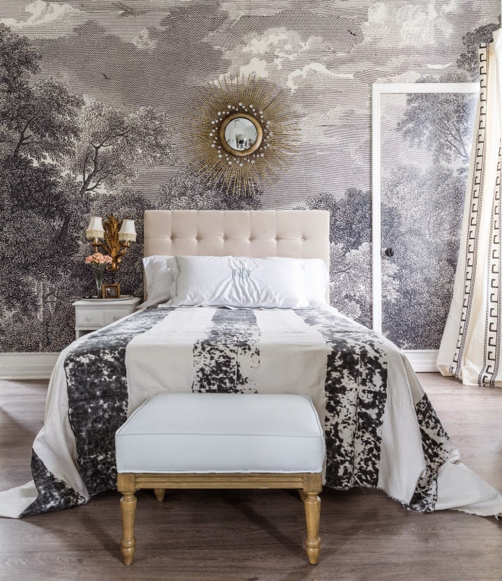
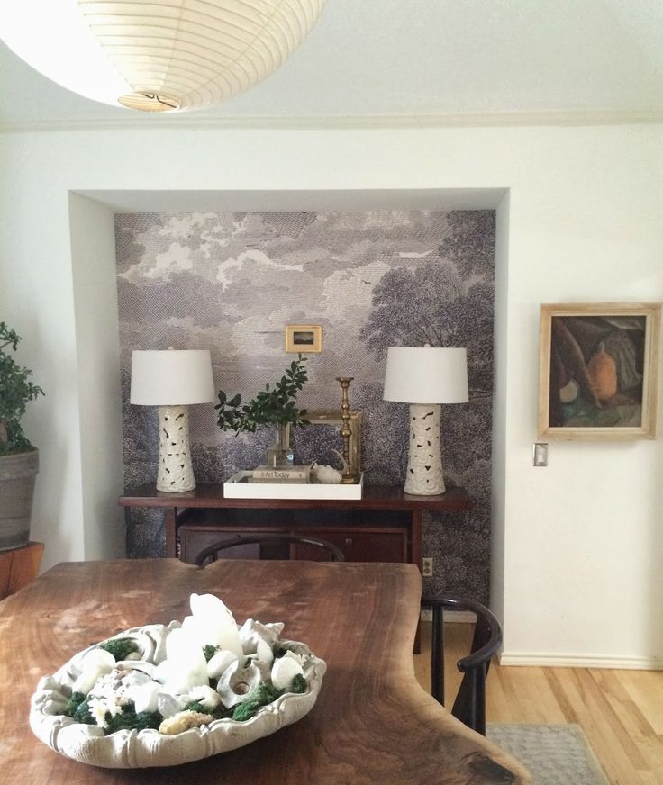
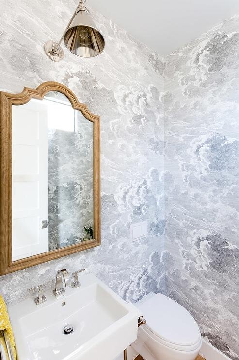
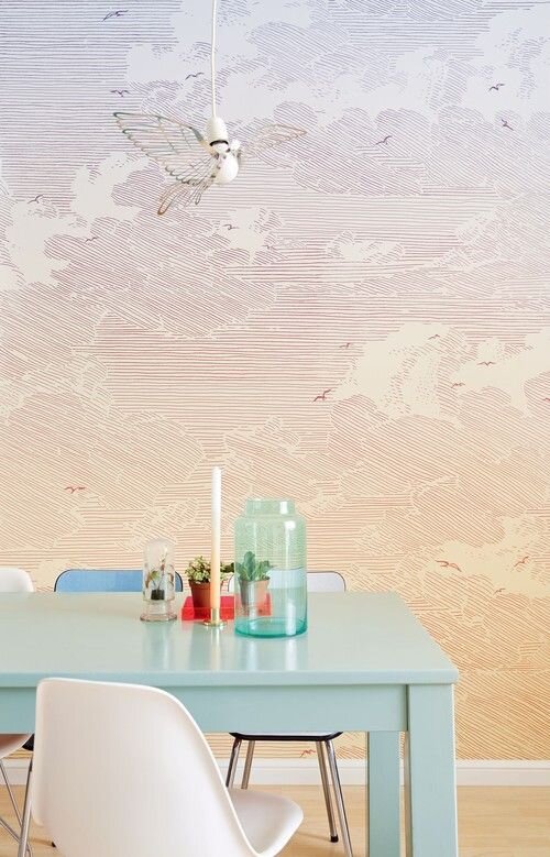
I’ve thought about getting other wallpapers for other areas in my house and some of them are also this style, though I debate whether it’s overkill. Here’s some of the others I’ve thought about for the kitchen or living spaces, in this style. Mostly clouds and birds. The ombre is appealing to me because I know how hard that would be recreate by hand / paint.
As I mentioned above, wallpaper is so much easier to get now. My jaw dropped this year when I saw the Scalamandre Zebra wallpaper available on Anthropologie (best known by me from Wes Anderson’s film The Royal Tenenbaums.) I love that wallpaper and couldn’t afford it nor was I fancy enough to have a personal interior design connection, it so I decided to HAND DRAW my version (white tigers) on the walls of a small room, with black artist pens. I learned very quickly things take a lot longer to draw than you think they will. Take how long you think and multiply by ten. Tigers have a lot of stripes, guys. You’ll understand why I reduced my ambitions very quickly. Now they are great wallpaper sites like Rifle Paper Co, etc, as well. You can even easily access photographic murals as well.
Downsides:
Though this design is forgiving, and I actually kept extra scraps to patch up anywhere as needed, my husband is incredibly against me putting up any picture frames, bed frames or causing any kind of holes. He was, after all, the one that helped do most of the work in terms of putting it up so I get it. That limits my ability to be creative a little though, for sure a downside.
Another downside is that sometimes having a mural can be limiting in terms of what you do in a space. You can’t really move it unless you’ve installed it on panels (something I thought about doing!) So if I decide I want my bed on that wall, I can do it, but there are limits. This may or may not be an issue for you depending on if you like to figure out one layout and stick to it. I tend to like to move things around a lot, but I also feel like sometimes being held down by a choice is good for me.
Color wise, this is a mostly neutral mural, but at the same time I felt like it did limit my color choices a little. For example, I didn’t like my ochre yellow chair with that mural. You can do it, some people pair yellow and gray/black, but its a CHOICE. It’s not subtle. Also orange was out, because Halloween. Again, you can do it, but it’s a choice. “Why did orange even come up?” you might think, well it’s because I was looking at orange and vermillion side tables and looking at layering warmth into my bedroom space, which has grown more feminine over time, more eclectic, a little warmer.
Recently I’ve had some sinus issues and have wondered if I’m allergic to dust mites, and have been taking out any clutter or fabrics I can from my bedroom, and I have to say I’m really grateful that my mural is an art element I can keep in there without worrying about dust mites.
Note: This post and the last one would make it seem that this couch has been living in my bedroom this whole time and it has not. It was usually downstairs. I’ve had my bed against this mural with a metal bed frame, I’ve had a mattress right on the floor and it still looked cool. I had a rowing machine in front of it and it looked cool, desk, etc. This room just happened to have looped in terms of design over 4 years.
Conclusion:
This mural was a great investment while I’m living in this house (and it’s been 5 years here.) I hate that I waited so long to get it. If I ever need to move, I can either keep it up, I think it’s neutral enough, or it is designed to come down easily. If that ever happens I’ll give you an update!
*Where’s the cat tax and dog tax Jess?! you’re saying, I get it! I’m working on it.